4 dead design fads in veterinary clinics
Veterinary architect Ashley Shoults, AIA, considers a quartet of once-stylish-now-troubling veterinary hospital design fads that are fixable (we promise!).
Pastel colors and kitchen cabinets in the treatment area, we hardly knew ye. Let us mourn these fallen design fads ... (Shutterstock.com)First, before we get started, you should know we think the older hospitals in these pictures are great hospitals, and if we had to guess, we'd say they're still successful today. But time marches on and design trends are a fickle mistress, and every gorgeous design touch of today eventually looks like Grandpa's avocado-colored refrigerator.
That said, let's see what one veterinary architect-Ashley Shoults, AIA, of Animal Arts in Boulder, Colorado-sees as fads that are out of step with today's design. Plus, she shares what she does like on the inside of modern veterinary hospital designed for now and the near future.
Dead fad No. 1: Yellow-beige walls …
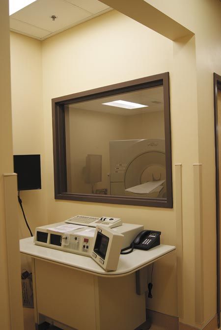
(All photos courtesy of Animal Arts)
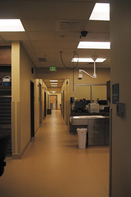
Yellow-beige is dead, people. It was a great experiment, but it gets dirty and looks bad over time. "It starts to feel dark and dingy," says Shoults.
... but you can fix it: Different neutrals
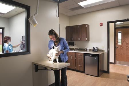
You can still stay neutral and avoid the problem of aging colors. Gray tones, for one, are a trend right now, says Shoults: "This makes the space feel brighter and more modern."
Dead fad No. 2: Too much color and saturated tones ...
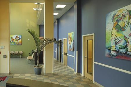
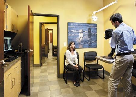
Too much of a good thing, right? "This used to be a popular approach to make things feel bright and exciting," says Shoults. "It's not so much a trend anymore."
... but you can fix it: Less accent color
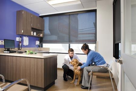
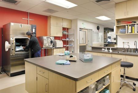
"We're back to the neutral walls with occasional pops of color," says Shoults.
Dead fad No. 3: Too much hospital white ...
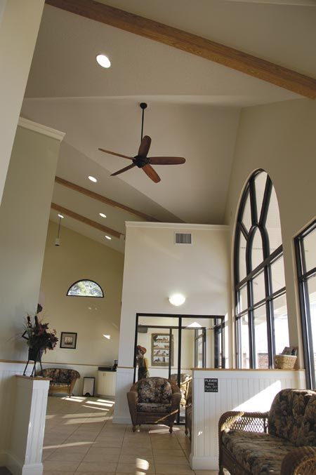
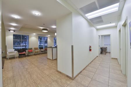
It's supposed to make a veterinary hospital look crisp and clean, like a human hospital, but that trend is on its way out in human hospitals for a reason, says Shoults. It's cold: "With time, it ends up looking boring, sterile and dated," she says.
... but you can fix it: See those different neutrals on Page 2!
Dead fad No. 4: Kitchen cabinets ...
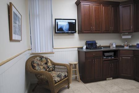
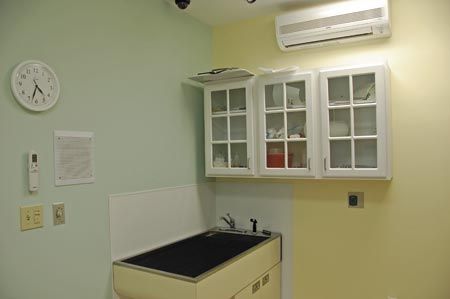
When you're going for the down-to-earth, homey feel, don't go with church pews in the waiting room and regular kitchen cabinets in the exam rooms and treatment area. They all look fun when you first install them, but they're not cleanable and they're not durable, says Shoults. Those beautiful fine lines in the wood gather gunk and grime over time. (And, psst-see the pastel green and yellow above? Those were once common, but not anymore.)
What Ashley will talk you out of, and what she won't
Veterinary architect Ashley Shoults works to do what veterinarians ask for-eccentric color choices or not. Where does she draw the line?
Whoo, boy, those colors. "I'll have the conversation [about dated or overly strong or bland colors], but I won't try to talk them out of it. I might show them some alternatives, but wall color is just not that big a deal. Paint on wall is easy and cheap to change any time."
Cute but uncleanable kitchen cabinets. "I've seen these fail so many times. So many contractors will come and ask to use different hardware to save money, but I'm going to fight for better cabinets [for durability and cleanability] for the sake of the hospital and the veterinarian.
... but you can fix it: Plastic laminate cabinets
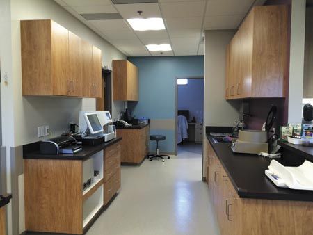
Get the wood look without the wood surface with more durable plastic laminate cabinets with better hardware and better cleanability, says Shoults. "There are lots of decent-looking woodgrain options out there now that look modern but still feel warm."