Building your veterinary practice color palette
From floor to walls and everything in between, here are some important things to keep in mind when choosing hues for your clinic.
Next >
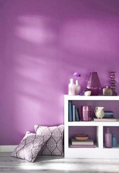
In December 2013, color systems provider Pantone announced its 2014 color of the year: Radiant Orchid. The color might be more appropriate for a Caribbean beach resort than a veterinary hospital, which makes me wonder: Should we in the veterinary industry even care about the latest “in” looks?

Pantone
On the one hand, color doesn't matter at all when it comes to the function of your hospital. On the other hand, color can be an important tool for establishing a mood or subconsciously telling clients about your practice philosophy.
Erring a bit on the pragmatic side, here are a few rules of thumb for selecting colors for veterinary hospitals:
Start with the floor
You'd be surprised at how limiting floor color choices are. We select the floors first and let the other colors harmonize with them. I like slightly darker floor colors because they show less wear and tear. Even if you like a light, bright clinical look, choose a floor that is darker than you might otherwise select and keep the light-and-bright colors higher up. Also, I am convinced that floors should be neutral, not colorful. You'll get tired of a colorful floor in a few years, especially when it's out of fashion.

Adobe Animal Hospital in Los Altos, Calif., opted for a darker floor tile and a lighter neutral hue for the walls.
Heather Lussier Photography
Use neutrals in cabinets and countertops
Cabinets are forever, so it's important to choose cabinet colors that will last. We might select something brighter and more colorful for a conference room, public space or break room, but we most often choose neutrals in the medical zones. Cabinets in medium to dark tones look classy, but most veterinarians prefer light colors for countertops. Speckled colors are more forgiving than solid colors.

PetCare Veterinary Hospital in Santa Rosa, Calif., chose a light neutral for the countertops at the reception desk, pairing them with medium-tone cabinets for an appealing and timeless contrast.
Tim Murphy, Foto Imagery Ltd.
Paint with color
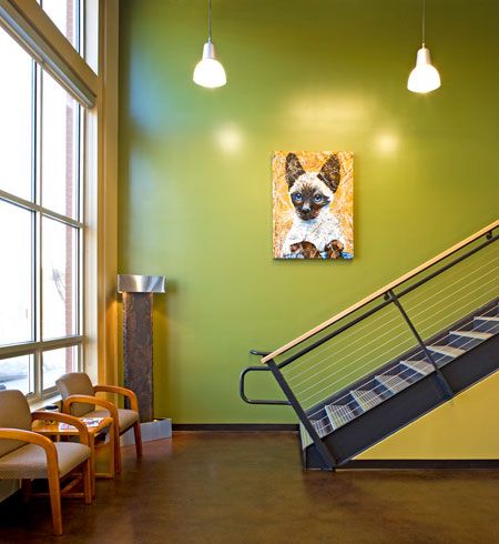
Painted walls are easy to change into next year's Pantone fashion, so we're more likely to recommend a little reckless abandon in this area. Upstate Veterinary Specialists in Asheville, N.C., has chartreuse green walls that make a bold, modern statement-especially when paired with fun wall art and simpler design features.

David Dietrich Photography
As you think of wall hues, consider these lessons I've learned over the years:
> Colors look more vibrant on the wall than on the swatch.
> Bright white doesn't belong on anything that's going to get a lot of wear and tear. Go for a light neutral for your base wall color. That being said, be careful with light neutrals derived from brown. The swatch might look beige, but when you put it on the wall, it could turn out pink!
> The best blues have lots of grey and some purple, like the hue below, used in VCA West Los Angeles Animal Hospital. Otherwise, they tend to look childish or reminiscent of basketball jerseys.

Tim Murphy, Foto Imagery Ltd.
> Avoid minty green. Those of us in healthcare industries still have post-traumatic stress disorder from that color.
> Nature-inspired colors are the most calm-inducing.
> Very bright colors-like orange, red or Radiant Orchid-are most effective in small quantities. You'll see talented designers unify a room with a restrained scheme and then select a bright pillow, vase or painting to add pizazz. This works well in a hospital setting as well. A few bright paintings, photographs or furnishings may be all you need.
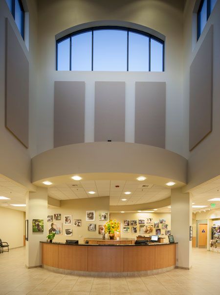
Below, you can see that 2014 Hospital of the Year Mueller Pet Medical Center uses a vibrant vase of sunflowers and playful wall art to add interest to an otherwise neutral color scheme.

Ed Asmus Photography
Ultimately, what I've learned when it comes to color is that less is more. There are exceptions to this rule, but for most projects, a color scheme that's well-coordinated and unified matters more than anything else.
Beyond those suggestions, feel free use color to reflect your veterinary practice's message, mood and mission. If Radiant Orchid says anything about 2014, we're going to have a fun year in hospital design!
Heather Lewis is a partner at Animal Arts, a veterinary design firm based in Boulder, Colo.