Everythings biggerand more efficientin Texas
What this emergency and specialty center lacks in space, it makes up for in efficiency and accessibility.
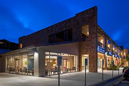
Austin Veterinary Emergency and Specialty Center | Photo courtesy of Thomas McConnell, Thomas McConnell LLC.
Austin Veterinary Emergency and Specialty Center (AVES) gets stuff done. The team managed to squeeze seven specialties (surgery and orthopedics, internal medicine, critical care, oncology, radiology, rehab and fitness, and dentistry) into an 11,081-square-foot leasehold in Austin, Texas. The dense floor plan, designed by Wayne Usiak, AIA, of BDA Architecture, was praised by experts in veterinary hospital design and earned a Merit Award in the 2016 Hospital Design Competition.
“Our floor plan was designed to promote a multispecialty collaborative approach to patient management while providing dedicated workspace for each individual department,” says Lindsay Vaughn, DVM, DACVECC, one of the seven owners of AVES.

Let's get physical: With its prime location at the front of the hospital in a room off of the lobby, the physical therapy room was designed for easy access for outpatient care. A large window provides natural light and free advertising as passersby can see the underwater treadmill in action. | Photo courtesy of Thomas McConnell, Thomas McConnell LLC.
Here are some design “truths” that the team discovered as they built their new hospital.
Sometimes less is more. It all started with a concrete slab. This conversion project was originally an undeveloped portion of a strip center. There were no walls, ceilings or floors. CEO Ryan Buck said this was ultimately a plus.
“The advantage was that there was no demo required and no existing infrastructure to work around,” Buck says. “We didn't have to build the exterior structure and had a ‘blank canvas' for the interior.”
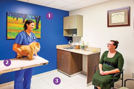
Exam time: The judges swooned over the eight efficient exam rooms (including one large exam room). “Single door exam rooms save a lot of space in your floor plan,” one of the judges said. A dark blue accent wall with a nature painting sets a calming mood for clients (1) and a carpet panel on top of the exam room table (2) creates a cozier experience for pets. Porcelain tile with a slightly textured finish was installed with an epoxy grout in all the public areas, including exam rooms (3). | Photo courtesy of Thomas McConnell, Thomas McConnell LLC.
Plans change. The original lease for AVES was 8,956 square feet, but about a month into the design planning, the team realized they were going to need a bigger boat so to speak. Good thing they had signed a contract with a right of first refusal for the adjacent open space.
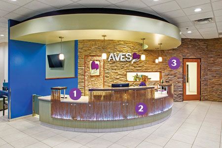
Rockin' reception: AVES wanted a large and aesthetically impressive reception area to knock clients' socks off the second they walk in the (emergency) door. We say mission accomplished with the solid surface countertops (1), backlit resin panels (2) and stone veneer wall (3) behind check-in. | Photo courtesy of Thomas McConnell, Thomas McConnell LLC.
“We realized that we needed more room to accommodate our programming and vision for the future,” Buck says. “We exercised our right of first refusal (or in this case acceptance) on the adjacent space, which took our total hospital space to 11,081 square feet.”
There will be problems 24/7. Clinics that don't close tend to come with their own unique set of problems and this project was no exception. AVES' two biggest hurdles? Hours of operation and signage. (The building had a previous restrictive covenant preventing operations 24 hours a day and the neighborhood associations banned significant signage on the building because of the “scenic highway” on the adjacent road.)
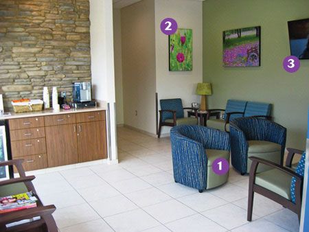
Take a seat: In a specialty and emergency hospital, a long-term waiting area isn't a luxury-it's a necessity. AVES opted for “mix and match” chair types (a combo of lounge chairs and tandem seating) and arranged them in private groups of three and four (1). Flower paintings and nature scenes (2) hang on the walls, complementing the stone veneer accent. A flat screen TV (3) helps pet owners pass the time while they wait. | Photo courtesy of Thomas McConnell, Thomas McConnell LLC.
AVES owners say don't be afraid to set up meetings with the local neighborhood associations and coalitions to negotiate terms (like they did). It will most likely delay your project, but you might just walk away with approval for a 24/7 facility and a monument sign at your veterinary center's entrance (like they did).

Illuminating veterinary care: This conversion project started out around 9,000 square feet but luckily the owners were able to snag the empty space next door, bumping up their total square footage to 11,081. An all-glass lobby not only looks stellar but also is a great way to showcase the hospital at night. | Photo courtesy of Thomas McConnell, Thomas McConnell LLC.
Start marketing now. Buck says it's never a bad idea to hire a marketing firm to help with the launch of your new hospital. “It doesn't need to be a firm that focuses only on the veterinary industry,” he says. “Picking one that doesn't have a lot (or any) experience in veterinary can help curate fresh ideas to help your brand stand out.”
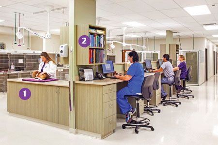
Treated with care: The open treatment area comes with a variety of tables to fit every pet and employee's needs (1). A rolling treatment station (not pictured) allows for more flexible patient care. And storage is not a shortage here. Overhead and under-the-counter shelves and cabinets (2) accompany every workstation. “Central ICU and the treatment area are situated adjacent to the reception waiting area and the exam rooms to facilitate prompt evaluation of critical patients and provide treatment stations for physical exams,” says Dr. Lindsay Vaughn. | Photo courtesy of Thomas McConnell, Thomas McConnell LLC.
The best part of the planning process? Vaughn says it was the ability to design and build every part of the hospital from the ground up-literally. “This allowed us to take into consideration the needs of each individual specialty and department,” she says.
One final world of advice from this Merit Award winner: “Think long and hard before going with vinyl composition tile,” Buck says. “While it is cheaper, it's also a pain to maintain. We have VCT in some areas of the hospital and wish we'd spent a few more dollars for another material.”
Want to see more photos of this hospital? Click here for a full photo tour.
Ashley Griffin is a freelance writer based in Kansas City and a former content specialist for dvm360.