Hanging with Hafen: Last but not least
Here's a look back at the best of the best hospital design winners.
Another month has come and gone, and here we are to resume our jaunt down memory lane. These last 11 hospitals, Hospital Design winners from 2000 to 2011, represent different ideas in terms of scope, concept, and innovation. They run the gamut from a 2,736 square-foot Amish country general practice to a 24,000 square-foot specialty referral and emergency practice complete with a linear accelerator.
Centennial Valley Animal Hospital

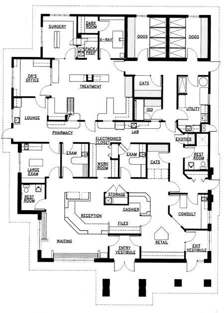
Looking back, it's funny how some hospitals present dramatic, groundbreaking design solutions and others are just darn good plans. Centennial has a darn good plan. Often we find it easier to lay out plans when buildings are deep as opposed to wide. This is the case with Centennial. You might also find that these days we push the exam room capacity of facilities harder then we did this one. On the other hand, Centennial has rooms that are spacious, including two oversized exam rooms. It also has some features that many of our current facilities don't have, namely an island reception where you circulate around a free-standing counter that has a clear one-way traffic flow and separate “in” and “out” sides. This plan also has a separate exit door and it features a cat boarding area that faces into reception. Not groundbreaking, but nice.
Carriage Hills Animal Hospital and Pet Resort
This project was a renovation and expansion of an existing facility. In contrast to Centennial, this plan includes a number of groundbreaking ideas:
- The waiting area stretches along the front of the hospital, linking the boarding area and check-in with the entry atrium, a nutrition/food retail center, a kids' play area, and an adoption center. We called this concept a “client service mall."
- The boarding area is also a significant departure from the past. Instead of runs for the dogs, this is the first time we designed for upgraded dog suites. Built more like bedrooms for dogs, they included Dutch doors, pictures on the walls and even a television in each suite. An outdoor exercise space for the dogs was enclosed with Plexiglas walls and covered with a decorative canopy that matched the entry atrium. A dramatic step up from your generic chain link enclosed play yard.
- Even the cat boarding space was designed to be new and different. It is a sun-filled room with cat condos instead of cages and it includes a fish tank to keep the cats entertained. Carriage Hills still stands out as a groundbreaking facility.
Norwalk Veterinary Medical Center
Located in Amish Country, we consciously tried to make it appear Amish-like. The inside is a straightforward, two-exam-room facility. Outside we have vertical board and batten siding along with Victorian scrollwork. Providing the icing on the cake, the veterinarian's wife decorated the clinic lobby with antique quilts and planted a heritage garden outside. In 2011 Nancy and Dr. Ron Henrikson won first place in the AAHA Accredited Practice of the Year awards. We would like to think that the building contributed in some little way to their win.
Shallowford Animal Hospital
This hospital is similar to Norwalk in that it too reflects the rural vernacular architecture of Tennessee. Basically the exterior looks like an overgrown house while the interior is crisp, clean, and modern, right down to the cabinetry. Custom cabinetry that is ergonomically correct was designed for the lab, pharmacy, treatment, and doctors' station. We also designed a custom cat condo in the lobby that matched the rest of the cabinetry in the facility.
Pet Crossing Animal Hospital and Dental Clinic

When we first met Dr. Kate Knudson and Dr. Steve Barghuson, they were practicing out of an incredibly cramped 1,200 square-foot storefront in Minneapolis. While the facility was smaller than small, their practice style and their success were big. From there they jumped to a facility of 6,500 square feet and six-plus exam rooms. It's rare to see somebody make that big of a jump in facility size, but what was even more remarkable was the way they did it. The new facility included a remarkable living room-style waiting area with a two-sided fireplace in a full-height stone wall. On the other side of the fireplace, we built a sunroom adjacent to the consultation/comfort room to catch the precious rays of the winter sun. Kate and Dr. B, her husband, are fascinating, engaging, and dynamic people who have transitioned from the most meager of beginnings to create a building and practice that reflects their personal style.
Pet Medical Center
Over the years, we have designed quite a few veterinary facilities where the building originally started as a restaurant. Amazingly enough, freestanding restaurant buildings often have large open spaces that are easily remodeled into veterinary hospitals. For this hospital in Salem, Ore., we came up with the floor plan and the owner used a local architect to turn our plan into reality.
Alexandria Veterinary Clinic PetCare Center
Over the years we have done a number of log timber, lodge-like facilities as both veterinary hospitals and animal shelters. The Alexandria Veterinary Clinic is one our most successful examples. It is built around a soaring stone fireplace located in an oversized waiting area complete with log beams and columns. Located in Minnesota, the clinic makes you feel like you are hunkering down for a long winter's nap in the snowbound woods of the far north.
Upstate Veterinary Specialists and Emergency Clinic

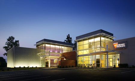
It's not often you get to work with a client to double your success. We originally built a 12,000 square-foot facility for Dr. Dermot Jevens and the gang at Upstate Veterinary Specialists that combined a small emergency clinic with their emerging specialty practice. Before building this facility they had been working out of a remodeled Hardee's restaurant. The new facility more than quadrupled their size. In 2003 they won Veterinary Economics Hospital of the Year. Three years after winning the award, Dermot called us up and said he wanted us to do it again. We were amazed and excited. So we set about doubling the size of the original facility. The new facility is 24,000 square feet and includes three sun-lit atriums, a CT, and a linear accelerator. Amazingly enough, we pulled off a “two-peat” winning Best Specialty/Referral Hospital in 2007.
Bay Beach Veterinary Hospital
Some hospitals win awards because they strike a chord. Bay Beach was one. This 6,400 square-foot, beach cottage styled hospital has a great front porch overlooking the marshes of the Chesapeake Bay. But don't let the country charm fool you, inside lives a high-tech animal hospital that won 2010 Co-Hospital of the Year.
Animal Emergency and Critical Care of Lynchburg

Animal Emergency and Critical Care is a straight forward design solution to a relatively small specialty practice that combines specialty surgery and an emergency practice. The floor plan combines a functional first floor for medicine with a second floor of offices. A balcony off of the offices overlooks the reception desk.
Adobe Animal Hospital
The back story of some award winners is almost more exciting then the actual facility. When we first started working with Dr. Brian Maxwell at Adobe, we were on track to build a freestanding, three-story building on ground that cost more a couple million bucks. But then the economic crisis of 2008 hit. Rather than give up the project, Brian found a freestanding grocery store down the street that was for rent. We were able to adapt the original program and even part of the design to fit the new space. The new facility is designed to be colorful and fun. It is also a very high-capacity machine, with 19-plus exam rooms in 14,000 square feet.
This brings us to the close of the exploration of our attic full of award winners. Looking back it's been a heck of a ride. It's been full of wonderful stories and fabulous facilities, but most importantly amazing friends and clients. We've broken a lot of new ground when it comes to veterinary design, and for that we have to thank our clients for having the ideas and giving us the opportunity to work with them. Together we did some very cool things and had fun doing it. The lesson from this trip down memory lane is that the right team, going in the same direction, can do wonderful things… for you, your staff, clients, the animals, and your community. We're looking forward to another 25 years of winning awards for our clients.