They care a lot!
We dont want to be corny, but the team at Care Animal Hospital of Pleasant Prairie opted for high-quality materials and carefully planned details that show they care about clients when it came to their new hospital's veterinary design.
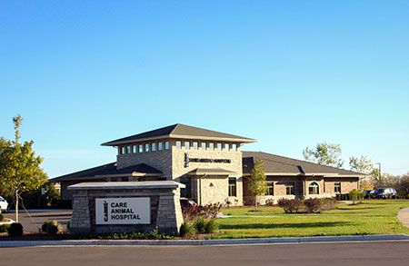
From the outside looking in: The team at Care Animal Hospital of Pleasant Prairie designed a building that reflected their high-quality standards for surgery and medicine -- inside and out. "Using less expensive materials not only, in the long run, makes for more expense as they wear out, but doesn't [accurately] portray what you do in the building," says co-owner Dr. Rebecca Wilsey-Brewer. This is why you can find natural stone surrounding the building and two different types of exterior signage. "As I always say to our surgery staff, 'Make sure the shaving is even on the outside [of the patient] because the client can't see the great job you did on the inside,'" Rebecca says. "The same goes for your building. If it looks fantastic, your clients will know that you're fantastic with your medicine and surgery, too." | Photo by Jennifer Pelphrey, Pelphrey Photography
Rebecca Wilsey-Brewer, DVM, and Russell Brewer, DVM, knew they wanted to team up as practice owners after they married and graduated from veterinary school two decades ago. What they didn't know was how quickly they would outgrow their original 4,950-square-foot building in Pleasant Prairie, Wisconsin.
Third time's the charm
Practice co-owners of this facility attended the HospitalDesign360 conference (previously the Veterinary Economics Hospital Design Conference) in 2008, 2013 and 2015. “Not only did we learn something new and different each time,” they wrote in their Hospital Design Competition entry, “but [the speakers] kept up with the time as to what flow and changes veterinary medicine was taking.” What were their most notable takeaways from conversations with experts at the show?
• Architect Mark Hafen explained that they'd outgrow their new addition sooner than they thought.
• Architect Dave Gasser showed them how the restaurant building they were considering for a remodeled new location would cost more than building new.
• Accountant Gary Glassman talked them into the right choice: building more than 10,000 square feet.
• Architect Wayne Usiak questioned how the new building would sit on the lot and improved some spots of workflow in the design.
“We have our current Merit Award-winning building because of all of their personal suggestions and invaluable information,” they wrote.
Learn more about the conference at fetchdvm360.com/hd.
“We spent almost 10 years planning what we wanted in a new building,” Rebecca says. “It had to continue our mission of providing high-quality care and increase comfort and efficiency for our staff, clients and patients.”
The new 11,836-square-foot space was worth the wait. Care Animal Hospital of Pleasant Prairie earned a Merit Award in the 2018 dvm360 Hospital Design Competition.
Check out three reasons the judges thought this hospital was a winner-and steal these strategies for your own veterinary hospital …
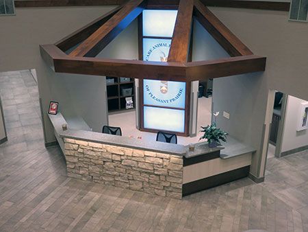
Phone-free zone: This is one reception desk where the clients in the clinic won't be competing with the phone lines. "Phones aren't answered at the front desk, which allows for complete attention to the face-to-face [interaction of] client and pet," the team wrote in their Hospital Design Competition entry. The hospital's natural stone front reception desk matches the outdoor stonework, and wood beam awnings, with built-in lighting, hang overhead. The hospital's blue backlit logo behind the reception desk is a center point for the space. An in-floor scale and storage cubbies for clients' prefilled medications, pet food and supplies help promote stress-free check-ins. | Photo by Jennifer Pelphrey, Pelphrey Photography
1. No time to wait
As Care Animal Hospital's square footage increased, client wait times decreased. How'd they do it? More exam rooms! Nine total-and an efficient floor plan-and you've got the recipe to exceed client expectations.

“The last building had the front desk away from the action of the back half of the clinic, which left the staff feeling disconnected,” Rebecca says. “We wanted the hospital flow to incorporate all of our team members, including assistants, technicians, doctors and front-office staff.”
By the numbers
Care Animal Hospital of Pleasant Prairie-Pleasant Prairie, Wisconsin
Owners: Drs. Russell Brewer and Rebecca Wilsey-Brewer
Number of doctors: 6
Exam rooms: 10
Total cost: $4,472,758
Cost per square foot: $268
Square footage: 11,836
Structure type: Freestanding, new
Architect: Steve Klessig, Keller Inc.
Secondary architect: Edward Klister, Birschbach & Associates
Photographer: Jennifer Pelphrey, Pelphrey Photography
Both owners also wanted the front-desk staff to help all clients-those on the phone and those in front of them. That's why the phoneless front desk and the designated phone room came into fruition. Now, staff members can easily divide and conquer, and no client feels left behind.
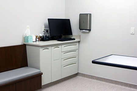
Let's take a look: As Care Animal Hospital's square footage increased, client wait times decreased. How'd they do it? More exam rooms! Nine total -- and each one features a fold-up, wall-mounted exam table to free up floor space for large dogs and services such as acupuncture and spinal manipulation. With a central vacuum system installed throughout the hospital and foot-controlled sweep outlets in every exam room, cleanup between patients is a breeze. Plus, built-in bench seating with storage drawers is a double win for clients and patients. "Extra towels and toys for children are found in these drawers," the team wrote in the Hospital Design Competition entry. The judges also praised Care Animal Hospital for the use of high-quality materials, including Midmark medical-grade cabinetry. | Photo by Jennifer Pelphrey, Pelphrey Photography
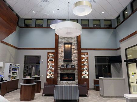
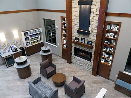
Wait a minute: With separate cat and dog waiting areas and a spa-like atmosphere, the lobby welcomes all species that walk in the door. Complete with a gas-burning fireplace, laminate wood benches and photos of staff pets, the space feels less like a waiting room and more like a living room. There's even an outdoor waiting patio for clients and pets who need fresh air. | Photo by Jennifer Pelphrey, Pelphrey Photography
Retail nook: The client hospitality area, featuring soda, water and a Keurig machine, is conveniently located next to retail. With trendy tile backsplash and sconce lighting, the corner has a welcoming feel, inviting clients to treat themselves or their pets. "The retail area is evolving into a space where clients can pick up a favorite treat or toy for their canine, feline or exotic pet," the team wrote in their Hospital Design Competition entry. | Photo by Jennifer Pelphrey, Pelphrey Photography
Want more dvm360 Hospital Design Competition content?
Click here for a list of winners of this year's competition and a schedule of when to keep an eye out for them to be featured in print and on dvm360.com.
Click here to find out the 2018 People's Choice Award competition winner and see images of all 16 of this year's entrants.
2. High-quality materials for high-quality care
“Using less expensive materials not only, in the long run, makes for more expense as they wear out, but doesn't [accurately] portray what you do in the building,” Rebecca says.
This is why their team opted for durable materials that would set them apart from the competition and make them an asset to the community, including:
• Medical-grade steel cabinetry in the exam rooms
• Natural stone on the lobby fireplace and building exterior
• Corian and uartz counters as heavy-use work surfaces.
“As I always say to our surgery staff, ‘Make sure the shaving is even on the outside [of the patient] because the client can't see the great job you did on the inside,'” Rebecca says. “The same goes for your building. If it looks fantastic, your clients will know that you're fantastic with your medicine and surgery, too.”
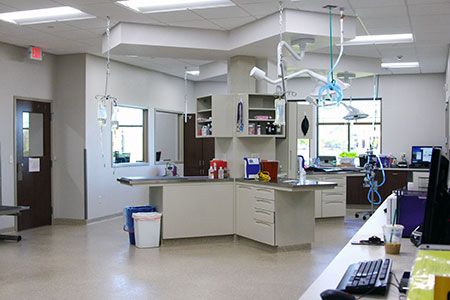
What a treat: The treatment room was designed to be the main hub of the hospital, with several rooms coming off it and a large X-shaped treatment island at the center of it all. The powder-coated metal island was custom made by Midmark with three dry tables and one wet table. Along the sidewall of the treatment area is a Shor-line lift table for staff comfort and ergonomics. The owners love the "fish bowl" effect of this room, with windows into the doctors' office, surgery and the great outdoors. | Photo by Jennifer Pelphrey, Pelphrey Photography
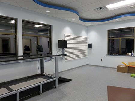
Underwater adventure: The hospital's rehab space features an underwater treadmill, and the room is soundproof to minimize sound from any noisy pumps. A wall-mounted computer and storage system provide space for lifejackets and special equipment. The epoxy floor that coves up the wall allows for easy cleanup of water messes. "Clients walking into the exam rooms can see into rehab, making for an easy way to market the service to hundreds of clients," the team wrote in their Hospital Design Competition entry. | Photo by Jennifer Pelphrey, Pelphrey Photography
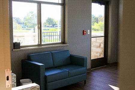
Saying goodbye: Complete with a custom stained-glass window crafted by Rebecca's dad, the bereavement room provides a space for staff, clients and patients to share some time alone. The room has a private door and patio, making outdoor euthanasia an option for clients. | Photo by Jennifer Pelphrey, Pelphrey Photography
3. A special place to say goodbye
When planning for the new hospital, the Care Animal Hospital team thought through the entire client experience-from start to finish.
“As much as the first visit is important, the last visit to say goodbye to a lifelong friend is just as important,” Rebecca says.
Complete with a custom stained-glass window crafted by Rebecca's dad, the bereavement room provides a space for staff, clients and patients to share some time alone. The room has a private door and patio making outdoor euthanasia an option for clients.
Russell is the one who had the vision to continue the attention to detail in the sidewalk outside the bereavement room.
“When the procedure is done, paw prints of cats, dogs, birds, rabbits and ferrets guide clients back to their car,” Russell wrote in their Hospital Design Competition entry. “This gives clients the feeling that their pet is still with them.”
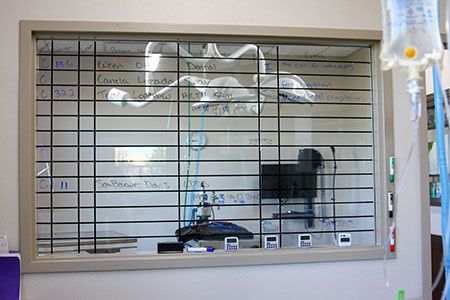
A sweet surgery suite setup: The surgery suites are attached to the large treatment room to help increase patient-technician-doctor contact. Both suites have similar LED lights, anesthetic machines, CO2 laser, large-monitor screens and a pass-through window to pack prep. The team added a vinyl grid to the window into the treatment room for an easy way to organize surgery patients. "There's also a set of full pass-through drawers that contain packs -- the drawers actually pass all the way through the wall from pack prep to surgery," the team writes in their Hospital Design Competition entry. | Photo by Jennifer Pelphrey, Pelphrey Photography
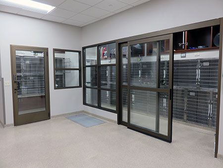
A quiet place: The canine ICU and cat ward are patient areas connected to treatment for critical and surgery patients. The canine ICU features a bank of cages with built-in storage cubbies above them. The practice owners say the sliding door to this area and glass walls are great for patient comfort and noise control. | Photo by Jennifer Pelphrey, Pelphrey Photography
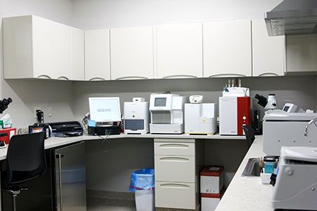
Lab work: The lab is located across from dental, allowing easy access from treatment and into the hallway pharmacy. It houses a full IDEXX lab, including SediVue, ProCyte, Catalyst, Catalyst DX and SNAP readers, plus two microscopes. An under-the-counter glass door fridge and freezer house all outgoing samples and slides for the equipment. A large pass-through window allows communication with the pharmacy hall, allowing samples to be delivered quickly and efficiently. A range hood is located over the centrifuge to eliminate stool smells. | Photo by Jennifer Pelphrey, Pelphrey Photography
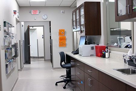
The great hall: The pharmacy hallway is the hospital's longest hallway -- it's the backside of exam rooms 5 to 9 and is stocked with common medications. The pass-through lab window is in this area as well as staff workstations. | Photo by Jennifer Pelphrey, Pelphrey Photography
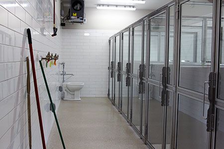
A place for the dogs: The hospital's canine runs are glass and stainless steel by Shoreline. Subway tile coats the walls and a covered trough allows for drainage. Each run features its own dog-height window. | Photo by Jennifer Pelphrey, Pelphrey Photography
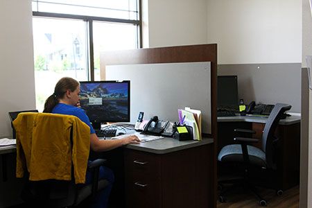
Calling all team members: The phone room is a designated space for hospital staff to distribute and answer phone calls in a quiet place away from the bustle of the front desk. Why? "To better make one-on-one contact with clients on the phone," the team explains in the Hospital Design Competition entry. | Photo by Jennifer Pelphrey, Pelphrey Photography
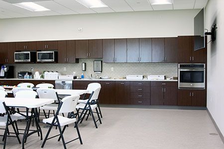
Give me a break: This multi-purpose staff room can seat up to 60 people for lunchtime, staff meetings or community events like 4-H meetings. It features an oven that can be used for baking clay paw prints and a TV for breaks as well as a sound system, projector and screen. Outside is a patio with a grill for staff picnics and lunches in the fresh air. | Photo by Jennifer Pelphrey, Pelphrey Photography
Ashley Griffin is a freelance writer based in Kansas City and a former content specialist for dvm360.


