Ain't life grand: The 2017 Specialty Hospital of the Year
OK, so they didn't set out to make the Taj Mahal, but at Pet Emergency Clinic & Referral Center clients, pets and specialist groups all benefit from a bigger hospital in Spokane, Washington.
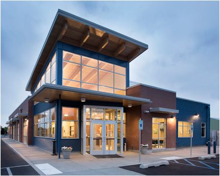
Pet Emergency Clinic and Referral Center was originally built in the mid-1970s, but they quickly outgrew the space, so the team decided to build on the vacant lot next door. What was once a 6,600-square-foot clinic is now a 15,453-square-foot hospital. The teams now have plenty of room to serve patients and clients. "The design, a brick exterior coupled with metal siding and a shed-style roof, is very similar to other new construction in the area--especially the nearby university campus and student housing," the team says in their Hospital Design Competition entry notebook. | Photo courtesy of Tim Murphy, Foto ImageryIs there anything they can't do? Surgery, radiology, internal medicine, emergency medicine and dermatology services now fit comfortably under one roof at Pet Emergency Clinic (PEC) & Referral Center in Spokane, Washington. Referral clinic by day, emergency clinic by night (and holidays and weekends), this veterinary hospital took home the 2017 Veterinary Economics Hospital Design Competition's Specialty Hospital of the Year award for their A+ efficiency.
Pet Emergency Clinic & Referral Center by the numbers
Board of directors: Dr. Jeff Siems, Dr. Katie Dull, Dr. Linda Wood, Dr. Vern Streeter, Dr. Mark McFrederick, Dr. Michael O'Dea, Dr. Terry Brown
Number of doctors: 21 full-time, 1 part-time
Exam rooms: 10
Total cost: $5,659,103
Building cost: $3,057,000 (building only; excludes land purchase, landscaping, parking lot, etc.)
Cost per square foot: $197.83
Square footage: 15,453
Structure type: New freestanding
Architect: Tony Cochrane, Animal Arts
Photographer: Tim Murphy, Foto Imagery
Learn their secrets to running-and designing-a successful specialty and emergency clinic.
1. Team up for ideas
“If you could have anything in the new building, what would it be?”
This was the question asked of each team on the building committee. Each group was represented in the clinic: the management team, the specialist groups, the shareholders and referral veterinarians.
“Then we gave the lists to the architects and said, ‘What can we do with our budgetary and space constraints?'” says Dr. Michael O'Dea, hospital manager and ER veterinarian. “Space was our biggest factor.
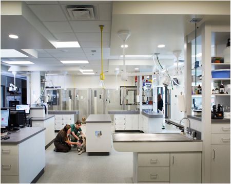
Treat your patients: The old clinic did not have an abundance of natural light and now (behold!) there are skylights in the treatment area. And that's not the only improvement or the most important. "In the new building the kennels are in the treatment area with plenty of cages. We also have more oxygen capacity for critically ill patients," O'Dea says. The team wanted to keep the treatment zone as open as possible. From the charting stations, staff members can see all the way through treatment and from treatment into surgery. Another critical feature for an emergency clinic? Designing a quick route to the treatment area. "It's a straight shot from the lobby back to the treatment area through a corridor along the south side of the building with swinging doors," O'Dea says. "So in the case of a very severe emergency, our staff can receive an emergency patient and bring them back to the treatment area for a quick assessment and further care." | Photo courtesy of Tim Murphy, Foto Imagery
The following items made the cut:
> Computed tomography (CT) unit inside the clinic-it was previously in a mobile van parked beside the old building
> Two radiography suites-one dedicated for the radiologist and the other open for the surgical group or internal medicine group to use as needed
> More critical care units and oxygen capacity for critically ill patients
> Greater separation between client areas and treatment areas-so clients don't overhear stressed or uncomfortable patients
> Several treatment peninsulas added throughout the hospital
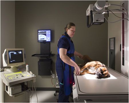
Double the fun: What's better than one X-ray suite? Two X-ray suites! No more waiting in line to take a pet's radiograph. In this new clinic, the radiologist has a suite right across from the ultrasound room and the surgical group or internal medicine group can use the second suite on the other side of the building. | Photo courtesy of Tim Murphy, Foto Imagery
2. Trust your architect
“We didn't set out to build the Taj Mahal of veterinary clinics,” says O'Dea. “But you look at the grand space of the new lobby and that's almost what it feels like.”
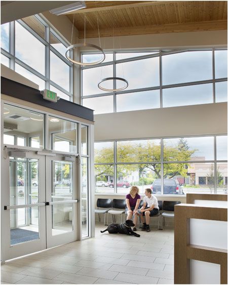
Pick a chair, any chair: Throughout the lobby there are several separate sections of seating, including a comfortable long-term waiting room, to give clients privacy. This is quite an upgrade from the small and cramped lobby in the old building. "The separation of seating areas allows clients to spread out and relax a little," the team says in their entry notebook. | Photo courtesy of Tim Murphy, Foto Imagery
Get inspired at the Hospital Design Conference
Attend the 2017 Veterinary Economics Hospital Design Conference in Kansas City, Missouri, August 23 - 25. Gather ideas, learn from the profession's most noted veterinary design experts, and compare your options for design, construction, equipment, financing and more with our exclusive hospital design exhibit hall. Visit thecvc.com/hd for more information.
Plus-Representatives from both of this year's Co-Hospitals of the Year will be on hand to share their secrets.
And when a 6,600-square-foot clinic (this was the maximum clinic size after multiple additions since the clinic opened in 1977) is replaced with a whopping 15,453-square-foot hospital, it's no wonder O'Dea is still in awe of the new space. And even with 52 veterinarian shareholders, they still left the look and feel of the clinic to the architects.
“The architects started out with lots of ideas and refined it to what you see today,” O'Dea says.
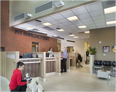
Step right up: During daytime hours, pet owners are greeted and directed to the appropriate check-in cubicle so each practice group can consult with their clients. During the ER night shift, staff occupies the first two cubicles so they can help owners as soon as possible. The brick on the building's exterior continues into the lobby and metal signage letters from the original Pet Emergency Clinic are displayed above the reception desk. | Photo courtesy of Tim Murphy, Foto Imagery
3. See the signs
Want more Veterinary Economics Hospital Design Competition content?
Click here for a full list of winners of this year's competition and a schedule of when to keep an eye out for them to be featured in print and on dvm360.com.
Click here for the 2017 People's Choice Award competition and images of all 22 of this year's entrants.
Keep your eyes open for the 2017 Hospital Design Supplement arriving in June with your issue of dvm360 magazine for even more great design content.
Clients can spot PEC from miles away-literally, thanks to the giant billboard sign located on the southwest side of the building. The sign once belonged to a gas station back in the day, but now it proudly sports the PEC name and logo. Why did they decide to keep the tall, tall sign? Well, because they could.
“Signs that tall are not allowed anymore,” O'Dea says. “But this one is grandfathered in. If we don't change it, then we don't have to conform to current codes for signage.”
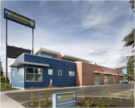
A sign of the times: This sign once belonged to a gas station back in the day, but now it proudly sports the PEC name and logo and clients can spot the clinic from miles away. | Photo courtesy of Tim Murphy, Foto Imagery
Score! This just goes to show, when life gives you a really, really big sign, you make it work for you. Not that you even need a sign when your clinic has been in the same area for 40 years.
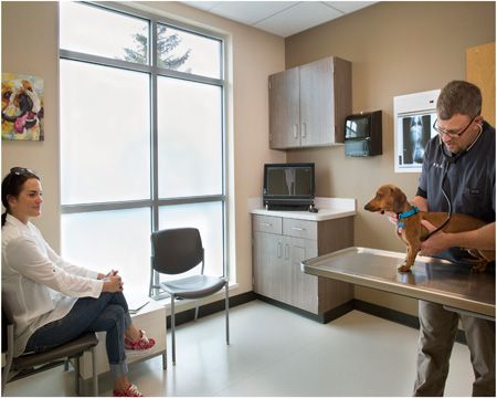
Exam room: All 10 exam rooms at PEC have two doors--one for clients and one for staff. This allows clients to easily exit back into the lobby and staff members to sneak out the back. These exam rooms also feature City View tile that is durable and easy to clean, a radiograph illuminator, overhead cabinet and workstation storage and colorful pet portraits. They also feature windows that invite lots of natural light to space--almost too much light. "On sunny days, too much light can inhibit seeing computer screens so throughout the last several months we've been upgrading the windows," O'Dea says. Adding a layer of "window frosting" helps keep the light situation under control. | Photo courtesy of Tim Murphy, Foto Imagery
“There was an opportunity to move to a different location nearby,” O'Dea says. “But when clients have pets in distress, now they can shoot right back to that same spot and we'll be there.”
Ashley Griffin is a freelance writer based in Kansas City and a former content specialist for dvm360.
FDA approves oral drug for broad canine protection against parasites
October 7th 2024Elanco's lotilaner, moxidectin, praziquantel, and pyrantel chewable tablets (Credelio Quattro) provide a single monthly dose for protection against fleas, ticks, heartworms, roundworms, hookworms, and 3 species of tapeworm.
Read More
dvm360 announces winners of the Veterinary Heroes program
Published: September 6th 2024 | Updated: November 5th 2024This year’s event is supported by corporate sponsor Schwarzman Animal Medical Center and category sponsors Blue Buffalo Natural, MedVet, Banfield Pet Hospital, Thrive Pet Healthcare and PRN Pharmacal.
Read More


