Editors' Note: You be the judge
What did you think when you first saw this month's cover? Each month, we try to guess your gut reaction to the illustration.
What did you think when you first saw this month's cover? Each month, we try to guess your gut reaction to the illustration. We make every effort to create a unique and eye-catching cover that will invite you into our pages.

Take this month, for example. We wanted to focus on the difficulty of diagnosing pancreatitis, but, let's face it, the pancreas isn't the most visually exciting organ. And you've all seen the pancreas as well as illustrations of what a normal or an abnormal pancreas and its surrounding organs look like. We wanted a different look, so we decided to illustrate the mystery of diagnosing pancreatitis, possibly creating a spooky effect. Our initial thought was to have black and white predominate, highlighting the pancreas.

Steve Oh from KO Studios signed on as the illustrator. We turn to him and his wife, Myriam Kirkman-Oh, many times a year to create our cover illustrations. They, like the rest of our stable of illustrators, are certified medical illustrators of the highest quality.
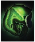
We casually mentioned that green highlighting might be eerie. So the first version came in (top), and we loved it. But then we spotted a potential problem—the green shading might imply chronic disease, even putrefaction. Definitely not the look we were going for. We wanted any pathology to be subtle.

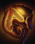
So, sigh, even though we really liked the illustration as it was, we had to figure out what highlight color would be more appropriate. Something warmer and closer to the real color of the organs might work. So we tried an orangey yellow (middle). This look is definitely nice but similar to many anatomic illustrations already out there. And we thought some areas might have become too highlighted, drawing attention away from the pancreas. More important, with the new highlighting the overall effect might suggest icterus.
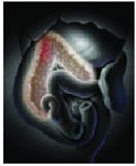
Darn! Still not right. OK, we thought, let's go back to our original idea of black and white. The third version was the charm, we think (bottom, the final version). Feedback from veterinarians we consulted was positive. It was stylistic enough to show that we weren't trying to be true to the real color of the internal organs. And we think the mysterious aura is present in full force.
Our covers exemplify the effort we put into everything associated with the journal—the right topics, authors, reviewers, wording, and more. So you be the judge—and let us know whether we got it right this month.