A walk in The PARC: 2020 Hospital Design Competition
Transparency, revolutionary care and staff development are the hallmarks of this stunning Texas practice, which was named a runner-up in the 2020 dvm360 Hospital Design Competition.
While dining at a local restaurant that specializes in fresh, organic food, Steve Hotchkiss, DVM, had an epiphany that shaped plans for his long-awaited new veterinary facility. The restaurant featured an open-design kitchen in which the cooks easily communicate with those in the dining area. Dr. Hotchkiss, owner of The PARC in Fort Worth, Texas, could see the kitchen staff cutting fresh vegetables just 10 feet away from where he sat.
“It was calming to know I could trust the food they were preparing for me, and people need that same trust with their veterinarian” he says. “If there’s trust, the pet wins, the client wins and we win as a profession. I told my architect that I wanted the first open kitchen in veterinary medicine. If people can’t watch it, I don’t want to do it.”
It’s clear from the outset that The PARC is built on transparency. From outside, one can see directly into nearly all areas of the hospital. Metal art, crisp blue colors, bright lights and comfortable seating areas complete the look. The second-floor staff balcony is also visible from outside.
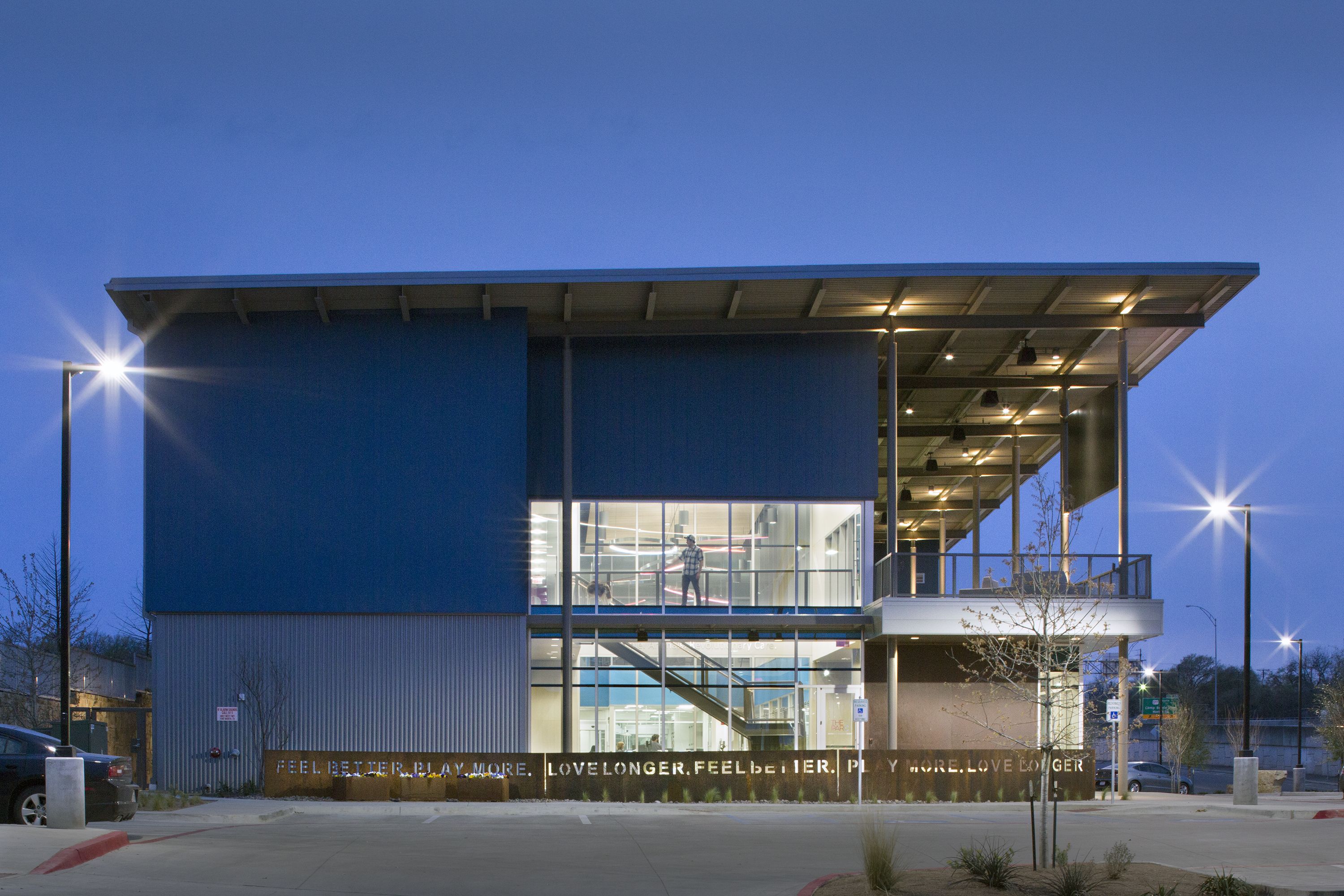
The open concept design led to the creation of a 25,037-square-foot practice built mostly of glass, allowing clients to see nearly all areas of the facility. Not only is the practice large and open, but it also boasts topnotch interior design. This exceptional focus earned The PARC a runner-up award in the 2020 dvm360 Hospital Design Competition. The competition judges praised The PARC for a thoughtful design that revolutionizes veterinary care. They said this hospital exhibits a huge “wow” factor in all areas of design.
The waiting area features multiple comfortable seating areas with curved benches and plenty of space, never making clients and pets feel cooped up. A metal stairway leads up to a second-floor waiting area, often used by those waiting a bit longer for pets that are in surgery. The frosted glass trees on the front window are mimicked in the chair backs in the lobby. A rubber floor minimizes noise in the open space.
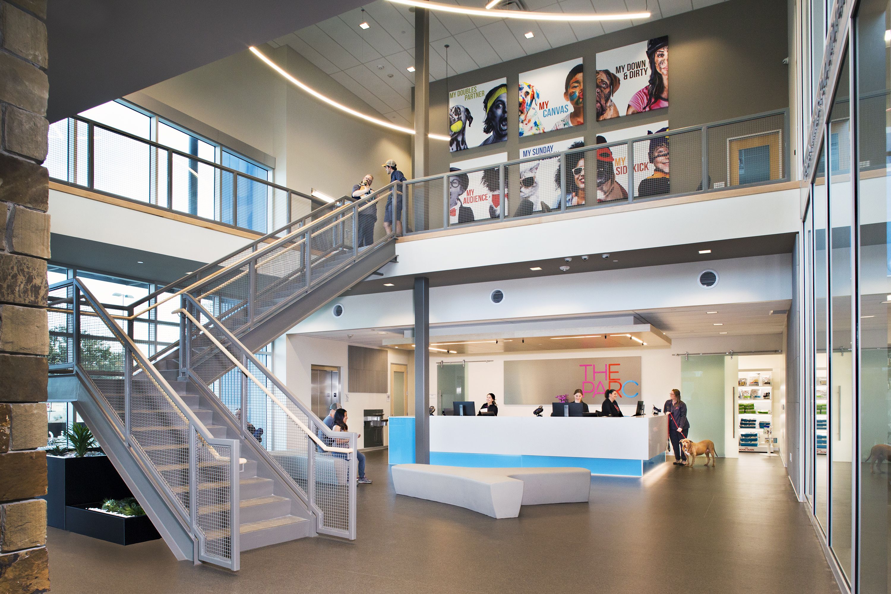
Open-concept hospital
The PARC has been in operation since 1992, just under a different name and in a much, much smaller space. The initial 3,600-square-foot practice housed 10 doctors and 75 staff members at its peak, open 24 hours a day to stagger shifts. Good, available land was in short supply, but Dr. Hotchkiss knew a larger facility was on the horizon. It took more than five years to find the right land and secure permitting, zoning and financial details. In the end, he snagged space just 90 seconds away from the original facility off a highway frontage road.
Next came the fun part—designing a facility to house his growing practice while being as transparent as possible, literally, with his clients. Dr. Hotchkiss was sure that an open-concept hospital was a perfect idea, but his colleagues weren’t quite on board.
The jewel box is the 40-foot-tall, glass-enclosed center treatment area. This central area is the highlight of the hospital, showcasing the work that happens in The PARC. Dr. Hotchkiss says this area was the original concept, and the rest of the hospital was built around it.
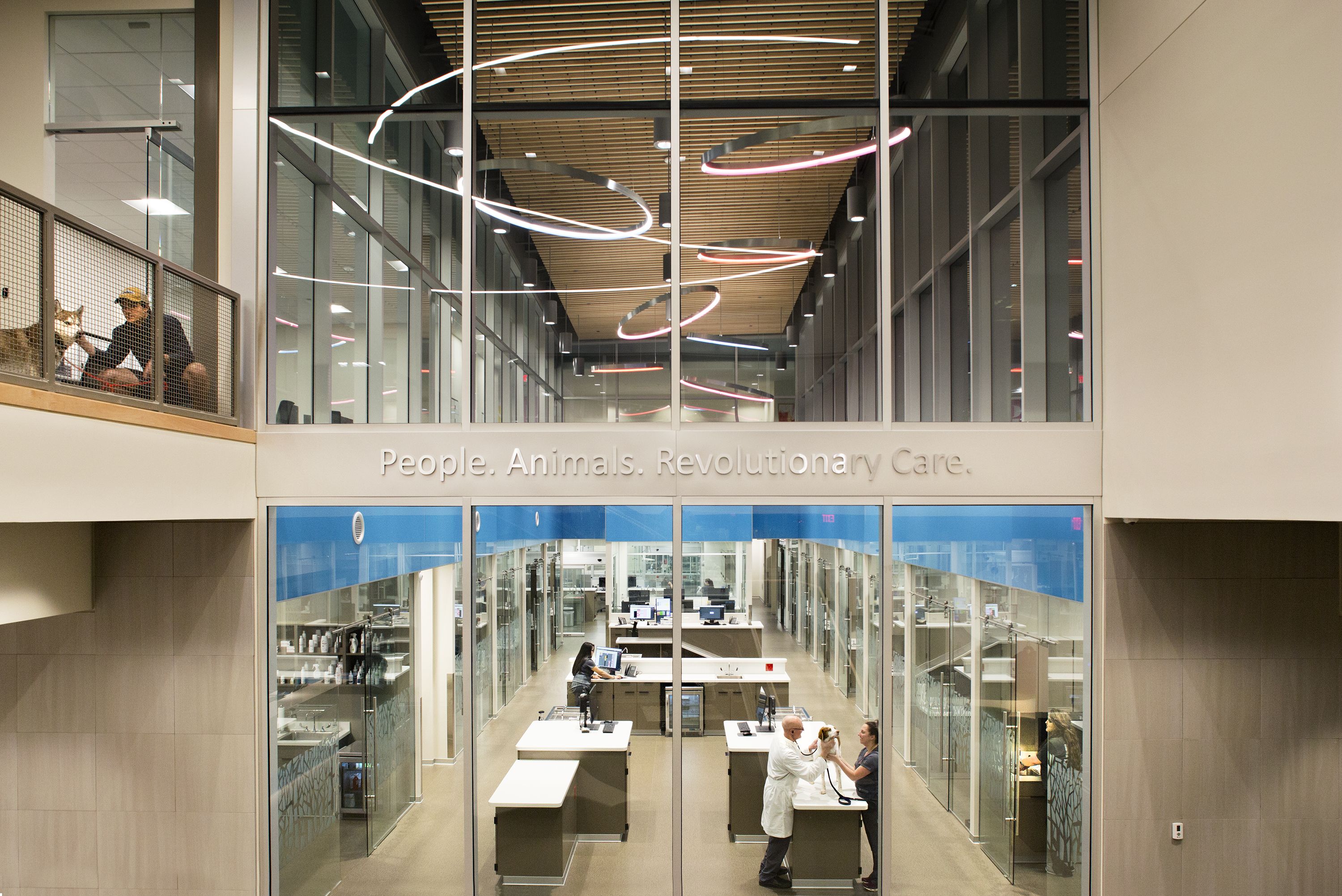
“I got a lot of pushback from my peers,” he says. “I think there’s a lot of fear in knowing pet owners can see everything you do. But my core value is ‘clear is kind,’ meaning that if you don’t want a pet owner seeing you do something, you shouldn’t be doing it.”
Each of the 14 exam rooms features the same frosted glass tree design on the outside, which is mimicked on the chairs in the rooms. Lots of glass keeps patients and clients from feeling trapped, and gives them a view into what’s happening beyond.
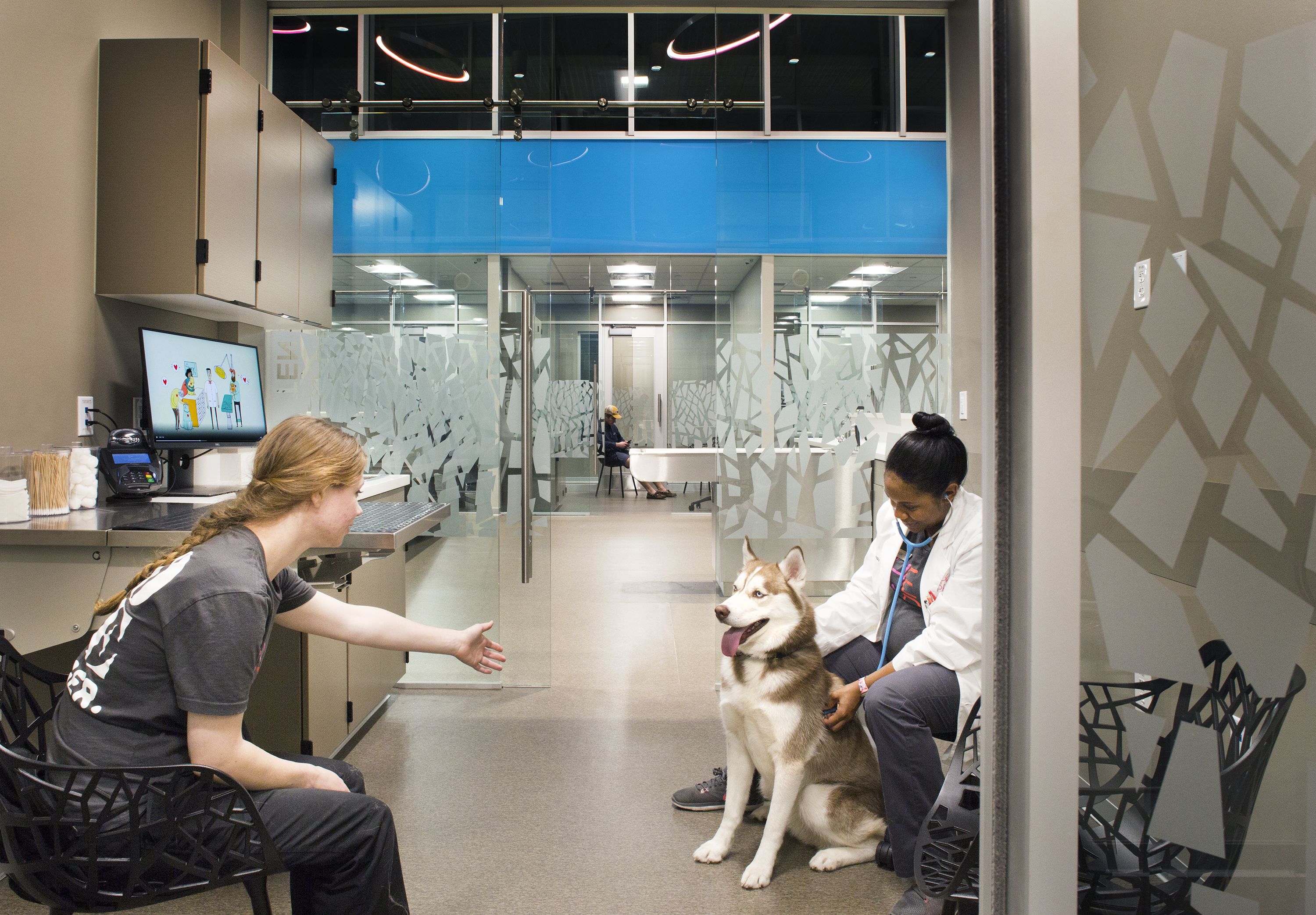
He went forward with his plan, despite the pushback. Now clients can see from the entryway all the way to the back of the hospital, if they really look hard. Of course, some things, like surgical procedures, are a bit too intense for clients to watch. For that reason, Dr. Hotchkiss positioned surgery suites and more invasive treatment areas at the back of the hospital to give a little buffer between clients and staff.
The PARC features three surgery suites, one specifically for orthopedics and one for neurology. The suites are filled with little subtleties that make working there more comfortable and convenient, Dr. Hotchkiss says. For example, he had gas scavenging installed at either end of the table, allowing doctors to choose which way to orient. “It’s a little luxury that makes working here easier,” he says.
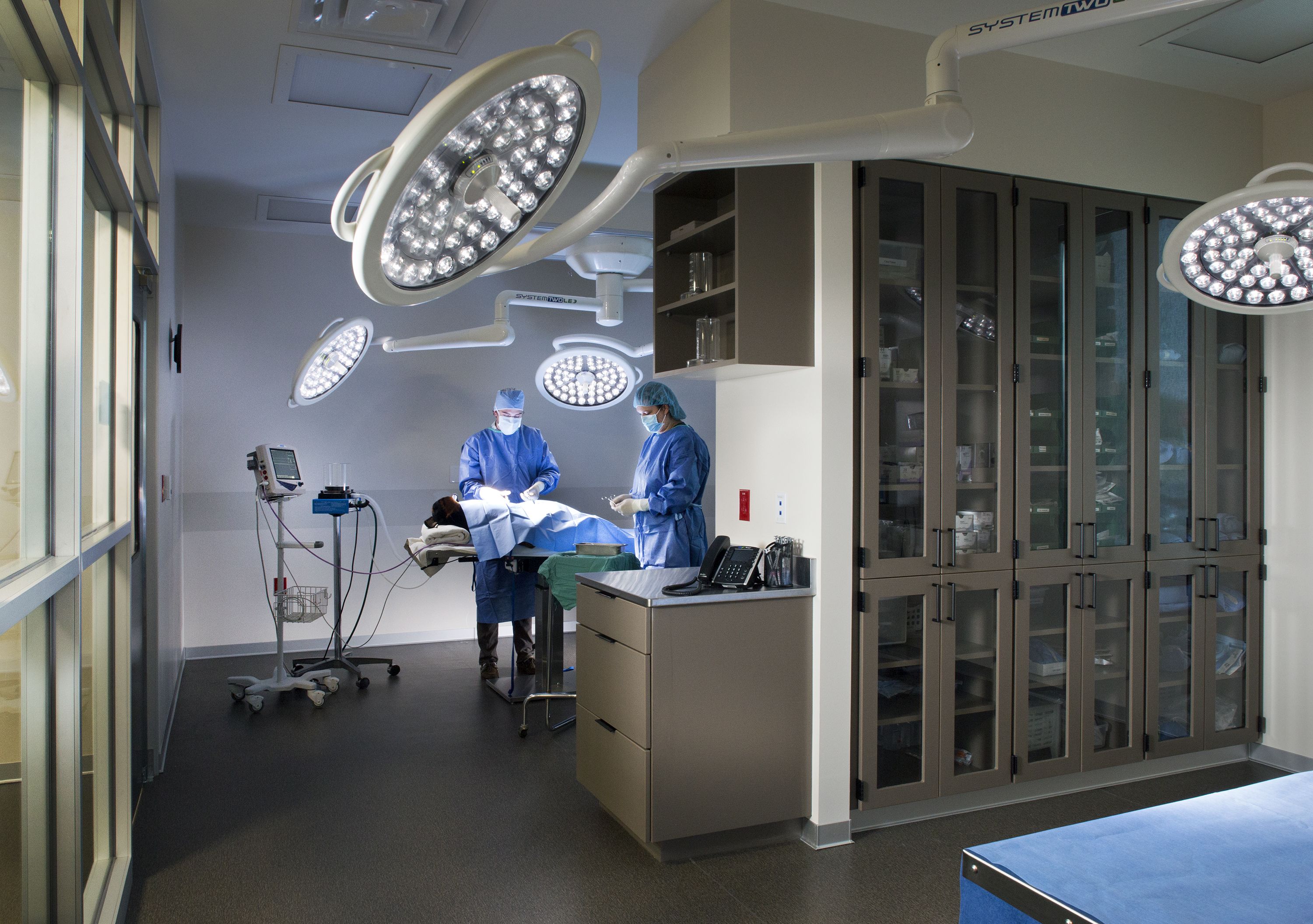
Staff members at The PARC felt on display for the first few months, Dr. Hotchkiss says, then they got over the discomfort of having windows everywhere. “Some people don’t like being in front of people or get nervous doing a task in front of clients,” he says. “But I reminded them that people aren’t as interested in us as we think they are. And I told them that they’d quickly get used to drawing blood and performing other tasks in front of people in no time, and it wouldn’t be a big deal. They adapted just fine.”
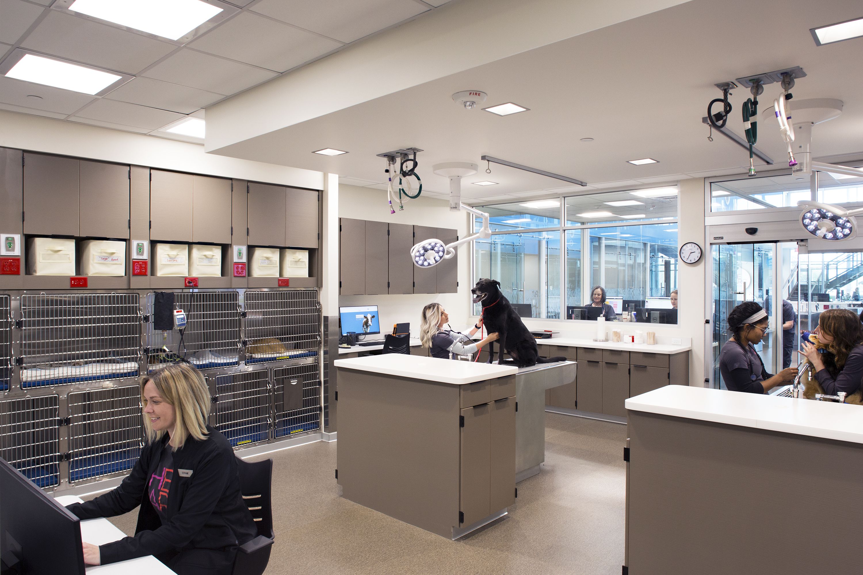
Dr. Hotchkiss says the treatment area was built with enough space that no one is waiting for a table, with workstations for staff plentiful. The treatment area features five technician workstations, plus one in every exam room.
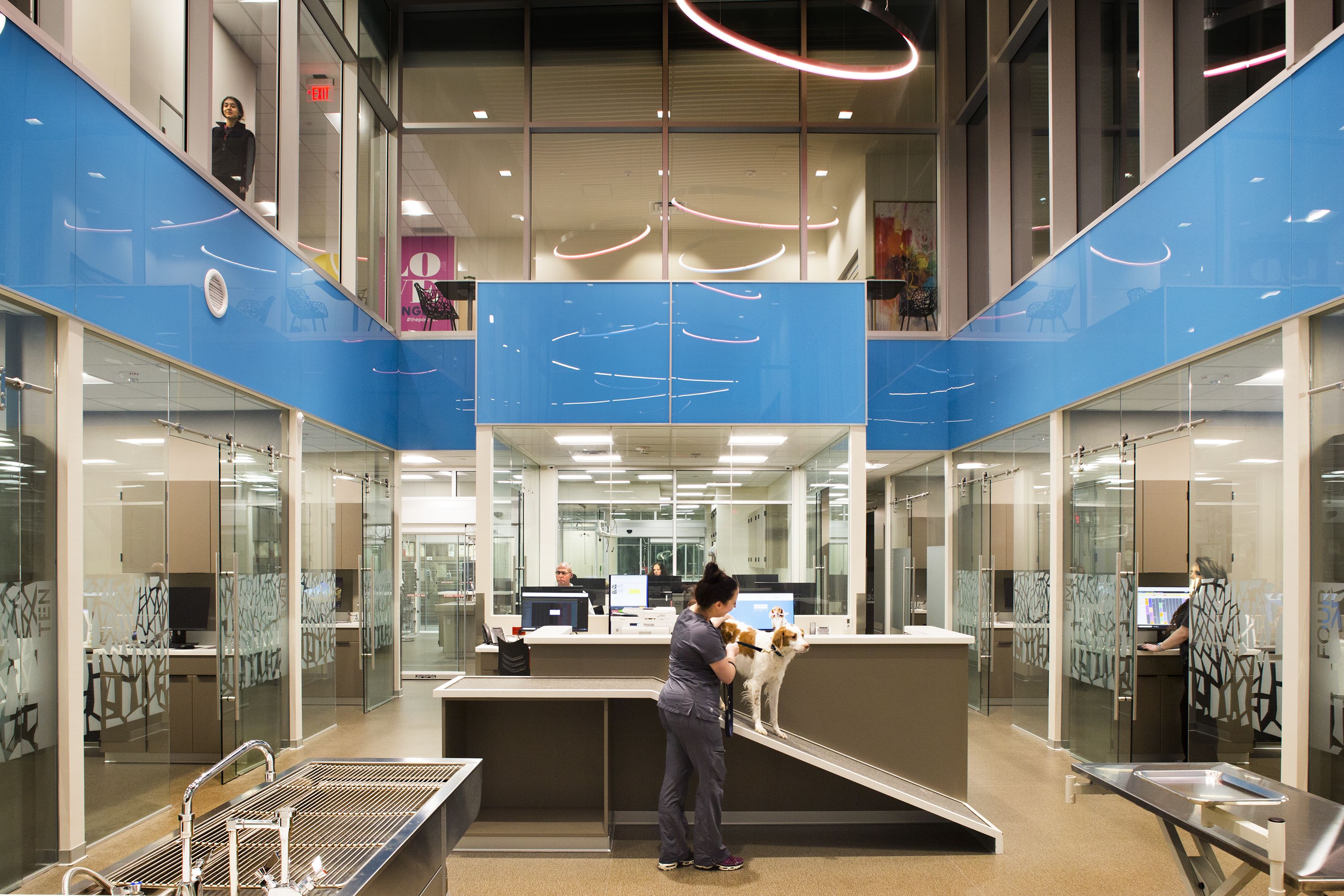
Of course, the comfort room, ICU, and surgery suites either have frosted glass or are positioned so far back in the hospital that a client would need binoculars to see that far, he says.
In the ICU, runs are custom-built at half height, making it easier for doctors and staff members to lean over and access the pets. “This way we can have better lights on the pets, more direct access to them,” he says. “If they are in ICU, they are sick enough to not jump out. And we can pet the dogs without having to open doors.”
Space for staff
Dr. Hotchkiss believes that staff members who are well taken care of will take good care of clients and patients. That philosophy drove a big part of his facility design, making sure to create spaces that make staff members comfortable, relaxed and inspired.
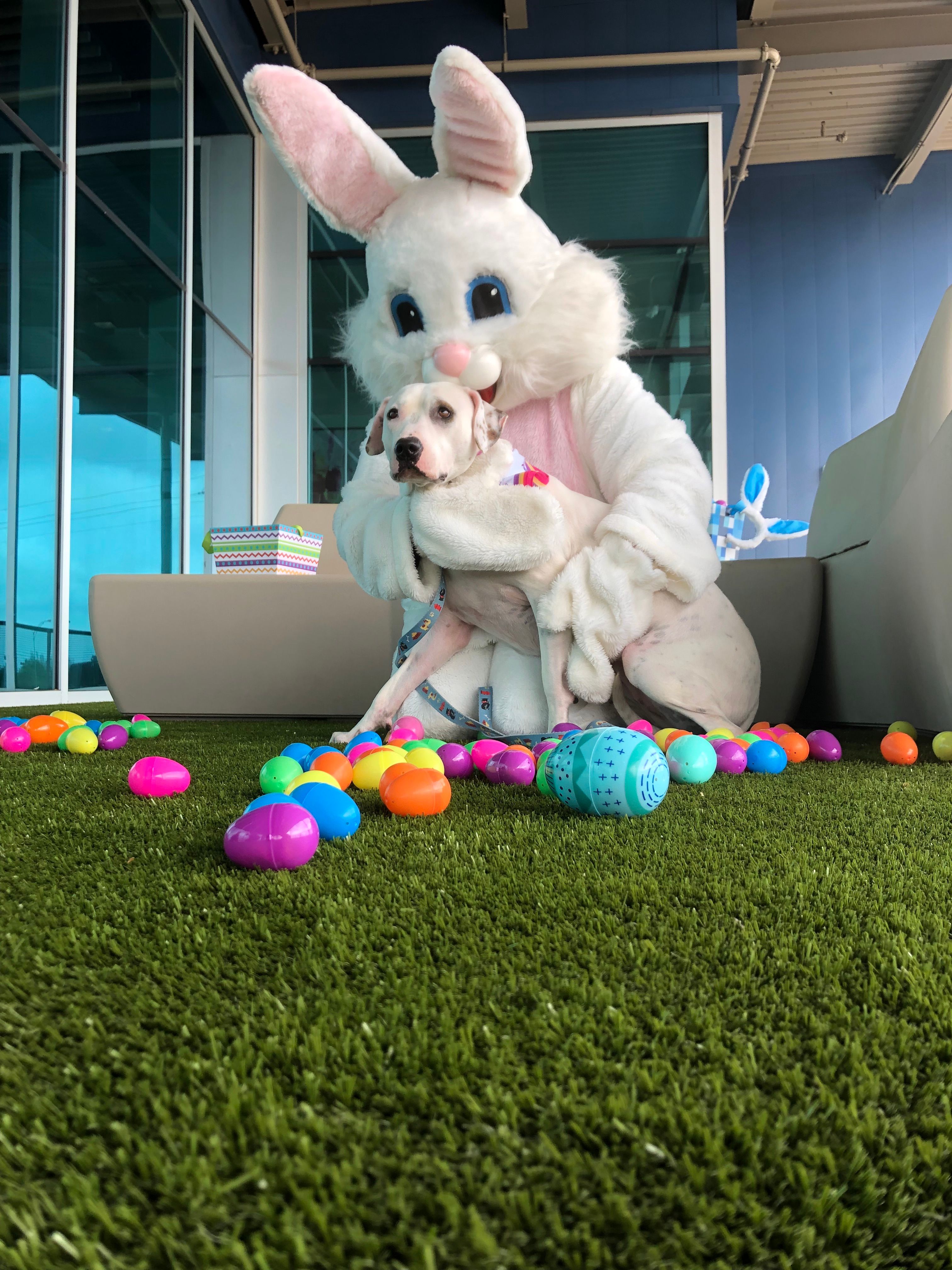
The second-floor balcony space is a treat for staff members, allowing them a place to take a break from the pressures of the day. This space is also used for client parties, goat yoga, yappy hours and more.
“At our old facility, I would find staff members going out to their cars to get an emotional break from our day,” he says. “There was no place in the hospital to recover emotionally from the hard things we deal with on an hourly basis. We needed a space for staff members to recover and take a break from all the difficult things we face.”
At The PARC, staff members now enjoy a large kitchen and break area, lockers, beautiful bathrooms even a 1,320-square-foot balcony for them to eat lunch or take a break. This space also doubles as a place for clients to visit for “Yappy Hours” and other community activities.
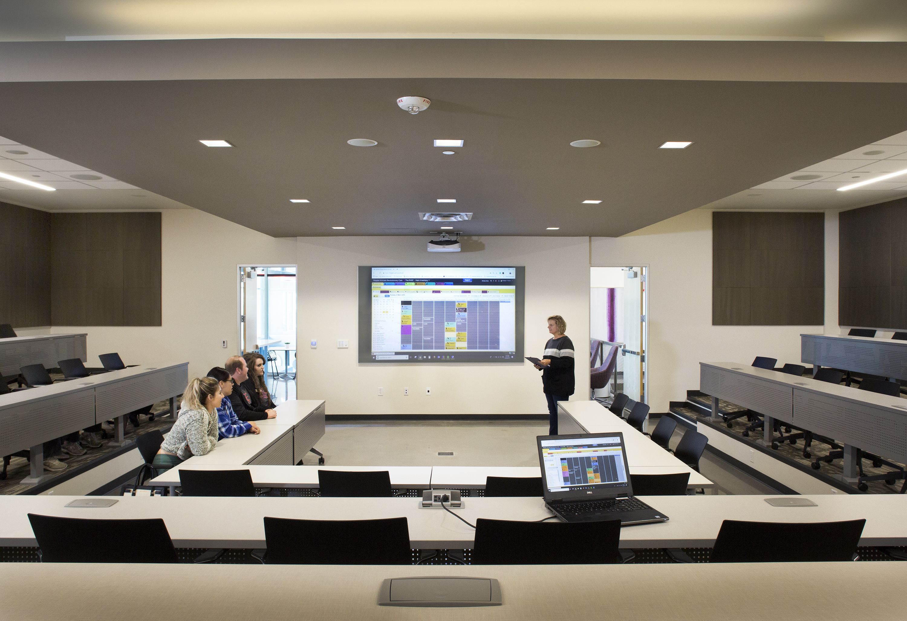
A 65-seat classroom, equipped with the latest audio-visual and sound systems, a glass screen for projection and a whiteboard, serves to keep staff members up to date on continuing education in a comfortable space. “We want staff members to know we value them and want The PARC to be a place for them to learn and grow in their careers,” says Dr. Hotchkiss.
The Thrive Room is for staff training. “We believe the outcome of training should lead to you thriving in work and personal life,” says Dr. Hotchkiss. “Here, we bring in talks from industry experts on anything from medicine to procedures, best practices, communication skills and more.”
Building a brand
While the physical facility at The PARC is undeniably stunning, another factor stands out about this practice: the consistent branding in every possible area. Take one look at The PARC’s website, signage, artwork, color scheme—anything, really—and you will see that no detail is left untouched.
“Our marketing comes out of a core belief to hire professionals to create something visual and tangible,” says Dr. Hotchkiss. “I wanted clients to see, hear, experience all aspects of our brand, consistently.”
While some might rely on a “social media–savvy employee” to put their marketing together, Dr. Hotchkiss says a strong brand takes much more than that. “I hired a marketing agency to handle our branding,” he says. “If I wanted a surgery performed, I’d hire a surgeon—not just someone who has seen it done. It stands to reason, then, that for marketing I’d hire a professional. Invest the money, get what you pay for.”
The marketing professional designed a “story brand,” which Dr. Hotchkiss says is perfect for his hospital. “Brands are built on a story, and our hospital has its own story. At The PARC, we have stories between each person and their pet, between them and us, and between us as a staff.”
The PARC’s story focuses on the unconditional love of pets and how they maximize life for the people who love them. This is shown throughout the hospital with whimsical photos, fun and comforting colors, bright, open spaces and, of course, a clear view of everything that’s happening in the hospital, bringing it all back to that desire for transparency in how they treat pets and people.
Dr. Hotchkiss even uses their story branding to advertise on bus stop benches, in magazines, and throughout the city, and the company he hired to put it together has won some advertising awards for its work on The PARC.
“We want to tell a story that makes the client the hero for their pet,” says Dr. Hotchkiss. “We aren’t here to be the hero, but to guide the client to be their pet’s hero.”
Sarah A. Moser is a freelance writer in Lenexa, Kan.