Nice curves
Dr. Keith Hilinski sought an upscale look when designing his 6,500-square-foot facility.
After practicing in a 1,700-square-foot strip mall facility for nine years, Dr.?Keith Hilinski made a huge leap when he moved to his new 6,500-square-foot space. But boosting square footage by almost 300 percent wasn't enough for this owner of Rolling Hills Pet Hospital in Chula Vista, Calif. He also wanted a eye-catching look, so he turned to his human medicine counterparts for inspiration.

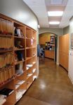
Hallway: The "backbone" of the hospital is this curved hallway (left), which features arched doorways, skylights, two-tone walls, and views into all working areas of the hospital.
"A plastic surgeon's office evokes quality and beauty," Dr. Hilinski says. "It shows that a doctor is dedicated to his practice." So that's what he aimed for. And the 2008 Veterinary Economics Hospital Design Competition judges agreed that Dr. Hilinski's new practice evokes the high-end atmosphere he desired, earning him a Merit Award in the competition.

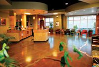
Reception area: Stained concrete floors, exposed Âconcrete walls, a curved reception desk with curved ceiling baffles, travertine tiles on the desk and columns, and amber pendant lighting complete the refined Âwaiting area décor. The ceiling is painted black with recessed lights to mimic an "endless starry night."
Hometown boy makes good
Born and raised in San Diego, leaving only to attend veterinary school at UC Davis, Dr. Hilinski felt a strong pull to practice in or near his hometown. But California real estate isn't exactly cheap, so he purchased a strip mall practice in 1998 and practiced there until he ran out of space. "We were literally bumping elbows trying to get in and out of exam rooms," he says.
After two years of looking for property at the height of the real estate market, Dr. Hilinski decided to lease a building five miles away from his original practice. In a mixed-use industrial park, his new neighbors include factories, carpet cleaners, mortgage brokers, and real estate agents—and rent was the same as it had been at the previous facility. That gave Dr. Hilinski money to spend on design and décor. Still, he had to employ a little creativity to get the practice he always wanted.
Caviar design on a burger budget
Dr. Hilinski wanted just one first impression from clients: "Wow." That's not easy without plenty of cash, but architect Melvin McGee and builder Fred Babuscio made it happen.

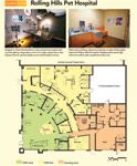
FLOOR PLAN: Rolling Hills Pet Hospital (PHOTOS BY ANDREW BATALLER, ANDREW BATALLER PHOTOGRAPHY)
For the hospital layout, Dr. Hilinski chose a curved "backbone" hallway to give the practice an upscale look. "A regular straight hallway looks too cramped and plain," he says. "We worried we were wasting space with the curve, but when the architect resketched the design without it, it just didn't have the same feel." He dressed up the area further with two-tone paint, skylights, and doorway arches, again reminiscent of a sophisticated human-medicine practice. The architect wife's, an interior designer of human-medicine hospitals, collaborated on the color and texture schemes.
Next, Dr. Hilinski decided to use high-end materials—but only in client areas. For example, Corian countertops adorn the curved reception desk where clients lean and write checks or talk to team members. Two feet away in a staff area, however, is a more modestly priced Formica countertop that looks similar but feels like—well, Formica. "I have a rule: Clients never touch stainless steel or Formica in my practice," Dr. Hilinksi says. In exam rooms, he installed Corian exam tables, but work counters are a lower-priced material.

A look at the numbers
Another trick to save money while creating an upscale, urban look: leave a few concrete walls exposed. In the reception area, Dr. Hilinski splurged on travertine tiles with matching columns. But he trimmed costs with a stained concrete floor and a few unfinished walls. "The result is a nice contrast to the tiles and upholstery used elsewhere," he says. "And it didn't cost a thing!"
Although it wasn't in the original plan, the practice saved money by not finishing 1,000 square feet of space. "We ran out of tenant improvement money, but it worked great," Dr. Hilinski says. "Now we can settle in and see what we really need that space for."
Can a clinic be too sunny?
No matter how good the building process is, some details always get overlooked. Thankfully, Dr. Hilinski's regrets are few—and minor. For example, the stained concrete floors were cost-effective, but moisture discoloration forced Dr. Hilinski to replace the original sealer with one that lets water evaporate through it.

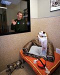
Boarding: Pets rest in the lap of luxury at Rolling Hills Pet Hospital. Acrylic epoxy flooring runs seamlessly up the walls for easy cleaning, and low air exhaust improves circulation to minimize odors.
Pros and cons also surround the exam room skylights. The entire team loves them, but that beautiful, bright California sunlight makes reading fluorescein eye tests impossible. So team members have to hightail it to the radiography room to read the stains. "Even so, I'd much rather have natural sunlight all day and walk a few paces to the radiography room," he says.
Lastly, with all that sun, Dr. Hilinski wishes he'd looked into solar energy when he was building. But he plans to include solar panels in the future.

Your hospital design source
The overall design is working. Production income has been up nearly every month since the team moved in. The staff is happy—though they've voiced concerns about cleaning such a large hospital. "I told them that if they keep production up, I'll hire a cleaning team," Dr. Hilinski says. Looks like he'd better start making some calls.
Sarah Moser is a freelance writer and editor in Lenexa, Kan. Please send questions or comments to ve@advanstar.com.