2015 General Practice Hospital of the Year: The personal touch
Follow the lead of this years Veterinary Economics Hospital Design Competition General Practice Hospital of the Year by drawing inspiration from your surroundings and making your clinic space uniquely yours.
Atwater Veterinary Center by the numbers
Owners: Drs. Charles Copeland, Carolyn Chiffelle, Paul Elliott Cook, Nicole Maria Ekblom
Associates: 3 full-time
Hospital team: 6 full-time, 5 part-time
Practice style: 50 percent small animal,
50 large animal (mostly bovine)
Building size: 5,496 square feet
Parking spaces: 19 client, 7 staff
Construction: $1,436,300 (building only)
Site improvement: $168,900
Professional fees: $339,600
Equipment: $160,424
Furnishings: $39,961
Computers: $21,751
Primary Architect: Rich Rauh, AIA, Rauhaus, Freedenfeld and Associates, (949) 697-6997, rfarchitects.com
Pluck Atwater Veterinary Center out of its surroundings, and locals would still likely know it belongs in Atwater, California. This small animal and bovine practice-the 2015 Veterinary Economics General Practice Hospital of the Year-brought local flavor indoors, personalizing the space and making clients feel at home. One competition judge said, “This hospital is superbly detailed.” When given the backstory, it's easy to see just how impressive that compliment is.
The owners were forced into this building project. In 2012, the city took the previous practice building via eminent domain-for the second time. At one time, the group of four co-owners had three hospitals. The first was taken by eminent domain for a bridge expansion nine years ago. They merged the second and third offices into one, which was also taken by eminent domain to make room for an expressway overpass project that leads to a local university.
"The very heart of our community here in the Central Valley is agriculture based. This was the theme we chose for our interior.”
-Dr. Carolyn Chiffelle

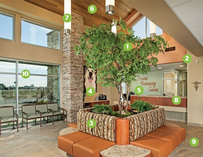
The reception area brings the outdoors in with a: 1) Faux Japanese Maple tree, 2) Earthy color palette inspired by the local environment, 3) Central seating with tear-resistant fabric, 4) Personalized artwork of staff pets, 5) Locally made laser-cut practice name sign, 6) Gabled clear-cedar ceiling, 7) Pendant lighting, 8) Reception-desk location makes for ease of traffic flow and entry monitoring, 9) Tile flooring wiht easy-to-clean epoxy grout, and 10) Brushed anodized aluminum storefront windows to let in natural light.
The doctors took the opportunity to build fresh and ran with it in a short time period of just 15 months. “We sat down and had a hard talk about what we were going to do,” says co-owner Carolyn Chiffelle, DVM, “We considered folding the Atwater clinic and just operating our ambulatory side of the practice. None of us wanted to incur the large debt associated with building a new hospital, but we had been an important fixture in the community for more than 40 years and provided needed services. And we couldn't imagine letting our long-term employees go.”

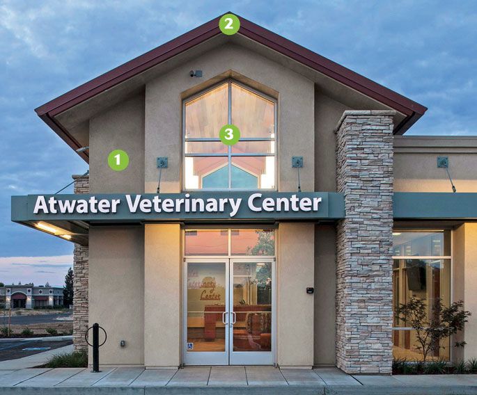
For a quicker build, Atwater Veterinary Center went with a steel exterior frame. Also: Light and dark tan paint (1) with green metalwork features and pale green performance glass blends into the local environment. A raised seam metal roof (2) over the lobby and reception area and brushed anodized aluminum storefront window wall systems (3) complete the look.
Fear-Free tip
“The central seating area offers easy separation of cats and dogs, while providing a calming, nature-like setting for clients and their pets,” says Chiffelle. For more Fear-Free tips, click here.
In the end, the doctors decided to make the most of a very difficult situation-and build the hospital they wanted. Making sure the new hospital represented the surrounding community was foremost in their minds.
“The very heart of our community here in the Central Valley is agriculture based,” says Dr. Chiffelle. “This was the theme we chose for our interior."
The hospital has commissioned a stained-glass piece for the lobby as well. The piece will highlight the nearby mountains of Yosemite, row crops and orchards of the Central San Joaquin Valley, quail and California poppies.
Focus on design details

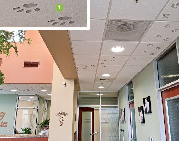
1. Fun trail: Paw prints on ceiling tiles run from one exam room to the reception area and disappear into the manager's office.

2. Picture perfect: The doctors at Atwater Veterinary Center chose personalized photos over generic artwork for their practice. A receptionist who is also a talented photographer took photos of all the doctors' and staff members' pets and created a portfolio. “We chose our favorites, then had Giclée canvasses made to hang throughout the building,” says Chiffelle. “This approach personalizes the practice for our employees and shows our commitment to our pets.”
For a full photo tour of Atwater Veterinary Center, click here.
Sarah A. Moser is a freelance writer and editor in Lenexa, Kansas. Please send comments or questions to ve@advanstar.com.