8 years to the perfect veterinary hospital
After many stressful days and sleepless nights, Dr. Steen landed a practically perfect practice.
One day, Dr. Ryan Steen invited his staff members to a team-building exercise. He asked them to write down two or three things they wanted to improve about the hospital and bring their ideas to a team dinner. After welcoming the team and assuring them he cared very much about their ideas, he told them the real reason for the meeting: to introduce the new floor plan.
“I wanted to surprise them,” says the owner of Frey Pet Hospital in Cedar Rapids, Iowa. “My architect was there, and he presented a computer animation of the new building. It was so cool to see the team excited about something I’d been excited about for so long.”
Dr. Steen was nearly ready to break ground on the hospital when he finally shared his plans with the team. Why’d he wait so long? “I kept it a secret initially because I didn’t know if I’d have the guts to actually go through with it, and I didn’t want to let them down,” he says. “But when I finally told them, it was a blast! It did slow the process a bit, as they all had their ideas to add, but it really made for something special.”
The Veterinary Economics Hospital Design Competition judges agree that the hospital is something special. They awarded Frey Pet Hospital a Merit Award for design excellence, citing the practice’s attractive exterior, incredible HVAC system, and high-quality interior design.
Photos by John Read, Read Photography
Years in the making
Dr. Steen started working at Frey Pet Hospital as a kennel attendant and had worked his way to veterinary assistant when he left for veterinary school, graduated in 2000, and came right back. The original owner, Dr. Dean Frey, offered Dr. Steen an associate position and soon after began planning for his eventual buy-out. And at that time, Dr. Steen began planning an extensive practice makeover. The practice had already undergone five or six remodels every which way, including up.
“Dr. Frey set the bar as far as how to practice, but the facility definitely needed an upgrade,” Dr. Steen says.
To make sure he got it right the first time, Dr. Steen spent years—eight, to be precise—perfecting his plan. His prep work included visiting hospitals across the country, keeping a file of past Veterinary Economics Hospital Design Competition floor plans and photos. He also attended the Veterinary Economics Hospital Design Conference in 2009. It was at that conference that he drew up his initial diagram of what he wanted the practice to be, which would go through more than 25 iterations before he finally got it just right.
“I admit, I stole most of my good ideas,” he says. “My main focus was to have a warm, inviting practice with a central treatment area to allow for a smooth traffic flow.”
Hashing out every detail of the plan proved tedious, but Dr. Steen wanted to make sure he got his first hospital build right the first time. “Hashing it out again and again, ad nauseam, is what allowed us to have what we really wanted in the end,” he says. “All the angst—agonizing over every detail, sleepless nights, and so on—paid off. I wanted it to be just right.”
Here’s the plan
Like most newer practices, Frey Pet Hospital features a central treatment hub, with satellite services as offshoots around the treatment area. What sets Dr. Steen’s hospital apart is the fact that nothing interferes with a staff member’s line of sight while in this area. The columns that usually dot the landscape of a treatment room are missing from this plan.
So before a wall was even built, the utilities were brought in underneath the treatment area. This meant the plumber, the electrician, and other contractors all had to work closely to make sure they hit a very specific spot where all these utilities would connect at the treatment tables.
Another feature that keeps business flowing is a simple lighting system that Dr. Steen designed (one idea he says he didn’t steal). “In our old practice, veterinarians often got caught up in small talk when taking charts to the reception desk,” he says. “To avoid that, I designed a lighting system in the hallway that limits our interaction with clients and staff at the front desk.”
In this system, when a doctor has a chart ready for a receptionist, he or she drops it in a basket behind the receptionists, flips a light switch, and moves on to the next client. The receptionist sees a small light at the front desk, and knows a client is ready for check-out—all without being interrupted.
Enhancing the client experience
Frey Pet Hospital found its client hook by designing the exam rooms around a theme and making them museum-like, rather than sterile, so clients enjoy their visits more. Each exam room features a different theme—fox, prairie dog, grizzly bear, and more. Clients say they can’t wait to come back and check out the next exam room.
A reflective garden, outside the comfort room, offers clients a quiet place to sit with a pet prior to euthanasia, to visit a sick pet, or just sit and reflect after a difficult appointment.
“Details like that really enhance the client experience,” Dr. Steen says. “The building came together perfectly, after all those years of planning.”
Frey Pet Hospital
2300 16th Ave. SW
Cedar Rapids, IA 52404
(319) 364-7149
fax (319) 364-4736
Owner: Ryan Steen, DVM
Associates: 3 full-time, 2 part-time
Hospital team: 18 full-time, 6 part-time
Practice type: 100 percent small animal
Building size: 8,055 square feet
Exams: 17 client, 21 staff
Cages: 37
Parking spaces: 17 client, 21 staff
Construction: $1.4 million (building only, excludes land purchase, landscaping,
parking lot, etc.)
Site improvement: $123,256
Professional fees: $93,329
Equipment: $229,553
Furnishings: $17,859
Computers: $22,354
Year built: 2011
Primary Architect:
Ed Sauter and Jim Baty,
Sauter Baty Associates
113 First St. NW
Mt. Vernon, IA 52314
(319) 895-8827
fax (319) 895-8830
Reception
The curved reception desk avoids corners that could be damaged by leashes. Neutral colors create visual warmth, as do pendant lights above the reception desk. Two entrances help minimize congestion, and clients appreciate the separate dog and cat reception areas.
Reception
The curved reception desk avoids corners that could be damaged by leashes. Neutral colors create visual warmth, as do pendant lights above the reception desk. Two entrances help minimize congestion, and clients appreciate the separate dog and cat reception areas.
Play area
The children’s play area offers kids a place to entertain themselves with toys and a flat-screen TV. To make life easier for parents, a wireless video camera is mounted above the TV, allowing parents to keep an eye on their children while they’re in the exam room.
Hidden table
Dr. Steen knew he wanted a comfort room, something his old practice lacked. A unique feature he included is a fold-down table built straight into the wall, rather than into a cabinet, as he has seen other practices do.
Treatment
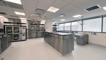
The central treatment hub is unique in that it is void of any columns or beams that house utilities. This allows for a clean line of sight for constant visual communication between staff members. To allow for this, all utilities had to be piped in prior to building the walls or installing the treatment tables.
Surgery
The surgery suite features air curtains on each side of the surgical tables to prevent cross contamination of airflow. Flat-panel monitors are mounted in each corner to view digital radiographs and patient information. Bluetooth technology transmits patient vitals wirelessly to the flat-panel screens.
Dog Runs
These four pens are for larger patients. The floors slope to a trough that runs along the back of the ward. The trough automatically flushes at designated time intervals to reduce odor.
Computer pods
Team members use data entry kiosks located between the pharmacy and exam rooms. These kiosks make it convenient to enter records into the system, keeping the practice paperless but well documented. The practice has doubled the number of computers compared with the number at the old facility.
Newsletter
From exam room tips to practice management insights, get trusted veterinary news delivered straight to your inbox—subscribe to dvm360.

