Blending past and present
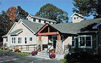
Using two historic buildings and a modern design, this hospital successfully honors the past, while stepping into the future.
FOR NEARLY THREE YEARS, DR. NICHOLAS SITINAS AND HIS WIFE, DR. STACY Robertson, co-owners of South Wilton Veterinary Group in Wilton, Conn., tried to convince a local landowner to sell them a piece of property that they thought would make the perfect home for their veterinary practice. In the end, their persistence paid off, and the completion of their vision won their new facility a 2006 Veterinary Economics Hospital Design Competition Merit Award. But that's not where the story starts.

As owners of a 1,400-square-foot three-and-a-half-doctor practice, these doctors knew they needed more space to better serve their clients. They had their eye on an old house and a barn that had been used as an antiques store at one time. The buildings sat just 8 feet from the road and had beautiful curb appeal and endless possibilities for the couple. Finally, the owner decided to sell. Then the real fun began.
Still playing the waiting game
"The existing buildings were great, and we were excited to preserve a part of history and the trees that surrounded the buildings," says Dr. Robertson. "Preserving old homes is our architect's specialty. What threw us for a loop were the 12 zoning variances we had to fight to get passed." The zoning process took almost a year to complete.
Zoning issues settled, there was a new problem: getting the old buildings cleaned out. The barn, which was in disrepair, was filled wall to wall and floor to ceiling with old books and antiques that the owner used to sell.

A look at the numbers
After several requests for the owner to clean out the building, Drs. Sitinas and Robertson resorted to holding tag sales, donating books to a local library, and giving some items to a local historical society. Then the barn itself needed a complete overhaul—including a new foundation.
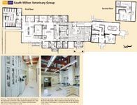
The old house, on the other hand, was in pretty good shape and mostly up to code. That left renovating both buildings to suit a veterinary practice and designing a central medical building to link the two older structures. The doctors chose to use the house for a phone room, employee kitchen, meeting room, and office for the practice manager and owners. They arranged the barn to include large runs and a bird and cat ward for healthy animals. The central building houses the reception and waiting areas, exam rooms, surgery suite, ICU, outpatient treatment areas, radiology, and the associate doctors' office.

Floor plan South Wilton Veterinary Group
Getting in the plan
It's not often you hear of people liking the floor plan so well in their former practice that they repeat it, tile for tile, in a new practice. But that was the case for Drs. Sitinas and Robertson in some areas of the practice. "Our old practice was amazingly well-arranged, for its size," Dr. Robertson says.
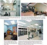
The doctors copied an intensive care ward from the old practice, taking the exact layout—an L-shaped corner—and the same doors, cages, tile idea, and floor drain. "This ward worked so well for us that we recreated it," she says.
The doctors did find some opportunities to improve on their former facility and incorporate new, efficient features. For example, they separated their phone room from the front desk. "When we planned this, it seemed very unique," says Dr. Robertson. "Since then I've noticed more practices doing this. It's great for us because the phone doesn't ring at the front desk at all, which leaves receptionists to greet and check clients in and out without any disturbances. The phone room, in a separate part of the hospital, is hooked to the rest of the hospital via intercom and computer, which speeds everything up."
Another unique feature, one Dr. Robertson says some people might view as a waste of space, is a separate outpatient and inpatient treatment area. "Our outpatient animals never go into the back ward with surgery and sick patients," she says. "Our day-to-day business never mixes with the back, where patients recover in a quiet area."

Keep staff members in the loop
To make this work, the doctors collaborated with their architect to design exam rooms that open to the outpatient area, which leads to the front desk. "We basically have a circle inside a circle, which keeps us and clients from doing a lot of unnecessary walking," says Dr. Robertson. "We take patients to the exam room, to the outpatient treatment area, then to the front desk to check out, then we go back again with another patient and client."
Dr. Robertson says this design works well for staff members especially, giving everyone a home base within the facility. "With more people and a larger practice, our approach to staffing has changed a bit, but it's philosophically the same," she says. For example, one doctor works strictly in the front outpatient area; another works in the back with surgical patients, and still another works with sick patients. Each technician has his or her own assistant. "We used a similar strategy in the old practice, even as small as it was, and we liked the arrangement," she says.
The doctors say the best thing they did when designing their practice was to put themselves in the plan as much as possible. "When you look at the preliminary plans, try to imagine the practice in 3-D," says Dr. Robertson. "Walk through it in your mind and think about how water will flow to a drain, where you'll need outlets, and so on. An architect doesn't necessarily know how your practice runs, so think it through yourself."

Opening day jitters
While the plan for the hospital came along smoothly, opening day wasn't as smooth. The doctors kept clients abreast of the building plans by posting photos at the practice and on its Web site. They sent cards announcing the move. And move-in day finally came.
"Opening day was a disaster," says Dr. Robertson. "Our security alarm went off, and the company had forgotten to program the codes to turn it off. Our computer system wasn't working correctly, phones were on the blink, and the air conditioning and electricity didn't work for part of the day. We decided business could only get better from there. It really was good that the problems happened at once and were corrected the first week."
Happily, clients didn't let these early glitches keep them away. And Dr. Robertson says that clients continue to take tours and love that the team's open-door policy lets them look around. Even community members who aren't clients stop the couple to compliment them on their attractive building. "Our townspeople liked that we renovated and improved the existing buildings rather than tearing them down and building new, like so many people on our street have done," she says.
Sarah A. Moser is a freelance writer and editor in Olathe, Kan. Send questions or comments to ve@advanstar.com.