Design to wow veterinary clients
Hospital efficiency and function are vital-but don't skimp on the interior design. Antioch Veterinary Hospital in Antioch, Calif., knows that first impressions can blow clients away.
Quick: What was the first thing you noticed when you entered your practice today? Did the sound of barking dogs and the smell of dirty pets assault your senses? Did you come in the back entrance next to a stack of garbage or the unkempt back patio?
Last question: When was the last time you entered through the front entrance, as your clients do, and took note of their first impressions? If it’s been awhile, you might want to give it a try.
For Dr. Howard Schutzman, co-owner of Antioch Veterinary Hospital in Antioch, Calif., first impressions are vital to attracting and retaining clients. When designing his new facility, a 2012 Veterinary Economics Hospital Design Competition Merit Award winner, great care and attention went into creating curb appeal that would wow clients. And that wow factor doesn’t stop at the front door.
“From the size of the reception area, to the height of the room, to the abundance of sunlight, we wanted clients to look around in those critical first few seconds and say, ‘Wow, this is something,’” says Dr. Schutzman. “We designed a reception area with a lot of ‘pop’ to impress our clients. We all know people make up their mind about a practice in the first few seconds. We have to make that impression count.”
The hospital design competition judges fell under the spell, calling the practice “striking.” They chose the practice for its great appearance inside and out, including a cat adoption center in the reception area, a clean traffic flow, and the lack of clutter throughout. “The place is perfect,” says one competition judge. “Everything is so put-together.”
Photos by Eric Rorer
Design is in the details
Getting the floor plan right was the easy part for Dr. Schutzman. After owning a number of practices and enduring two remodels, he already knew how to plan for foot traffic flow. The previous practice, an 1,800-square-foot leasehold, sits just two miles from the new facility. In the new practice, an open floor plan with an extra-wide pharmacy hallway greatly reduced traffic bottlenecks. Exam rooms that open directly into the pharmacy add convenience.
But Dr. Schutzman didn’t stop at designing a great floor plan. He wanted to go from good to great in every way. “I’ve seen so many beautiful facilities that could have been great, but gaudy interior design, mismatched colors, or lack of attention to detail ruin it,” he says. “The best thing I did for my practice is hire an interior designer. I don’t trust my own eye for these elements, but she brought it all together perfectly.”
His interior designer used a variety of warm, coordinating colors, wainscotting, and paneling, along with bold, colorful artwork to pull the look together. Dr. Schutzman eschewed the cold, stainless steel look of a clinical setting in favor of a warmer, more serene environment. “I really like the warmth that greets me when I walk into the hospital,” he says. “It doesn’t scream that it’s a veterinary hospital at all.”
Caring for the environment
Environmental as well as community considerations were important during the design phase, he says. “We attempted to be as green as possible within our budget and building constraints,” says Dr. Schutzman.
For example, a contractor suggested a reflective white “cool” roof that decreases the heat load on the building up to 40 percent, a great feature for the California practice. This was much more budget-friendly than, for example, a solar roof. “The amount of time it would take to get my money back on solar power probably wouldn’t be worth it,” Dr. Schutzman says. “But the white roof was a good idea. I don’t know what our utility bill would be without it, but even on the hottest day, we’re comfortable in the building.”
The practice also installed bioswales, a landscaping feature designed to remove silt and pollution from surface water. Dr. Schutzman had never heard of bioswales before, but a city requirement mandated their inclusion in the practice design. “We think they’re a great idea,” he says. “However, they were an unexpected expense, especially with the construction of the retaining wall.” Also, one of the rear bioswales contributed to the parking lot curb giving way. The team had to redesign that section of the parking lot and relocate the bioswale at the expense of three parking spaces. Thankfully, they had plenty of spaces to spare, so it didn’t impact the practice.
Sticking to your guns
Dr. Schutzman hired an architect with many years of experience in veterinary design, as well as a skilled local architect. Many reputable contractors also filled out his team of experts, for which he is grateful. However, he cautions against letting those experts make too many decisions for you. “At the end of the day, you’ll be living in this place for the next 20 to 30 years,” he says. “The contractors, no matter how great they are, might offer a solution that works best for them, not you. They complete your job and move on. And you’re left with that decision.”
He knows this from first-hand experience. One contractor convinced him to glue the sink backsplashes to the laminate countertops instead of using rolled backsplashes, as he originally wanted. The contractor assured him this special glue would work wonders and never fail. “Six months in, we had to replace our backsplashes because the water was damaging the laminate. I should have stuck to my guns on that one.”
The project is yours, he says. Know your vision ahead of time and stand up for what you want. “Everyone will be pulling you this way and that,” he says. “Every decision you make costs you money. So before you get going, estimate your costs and add 10 percent to 15 percent, because changes will be necessary, and they will cost you.”
From previous remodels, Dr. Schutzman knew certain design elements worked well, and he didn’t waiver on those decisions. But when the architect or a contractor suggested an idea he wasn’t sure about, he visited other project sites to see for himself—and get the other clients’ feedback before forging ahead.
Fitting in while standing out
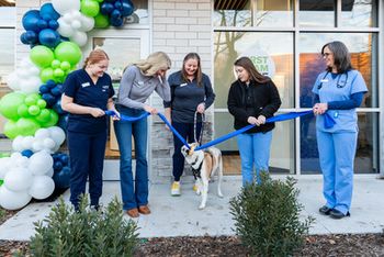
Treating pets is goal No. 1 at Antioch Veterinary Hospital. But another top goal is to establish the practice as a go-to resource for pet-health issues. “We’re not just a veterinary hospital, we’re a part of the community,” Dr. Schutzman says. To meet that goal, the practice hosted a large open house for clients, contractors, and the community. More than 300 people attended.
School groups often tour the hospital, something Dr. Schutzman encourages. “We designed our practice to be an open book. We want people to feel comfortable looking around,” he says. The practice also opens its doors to the general public for a monthly lecture series.
Last year, the practice granted two $500 scholarships to local high school seniors who won an essay contest. The scholarships were so well-received that four lucky students will earn them this year.
And pet-owning senior citizens who can’t make it into the practice enjoy house-call visits from the veterinarians and other team members.
“We want to build a strong presence in the community,” he says. “We’ve had quite a year, too, being nominated for the Antioch Business of the Year Award and earning an award from our local Best Of magazine.”
The practice has gained more than just recognition over the past year. It has also experienced huge growth, with double-digit increases in revenue. Most of all, Dr. Schutzman says he and his team like coming to work at a beautiful facility that feels like home.
“Before we remodeled our original facility, we said that clients came to us in spite of our hospital,” he says. “After we remodeled, we said that people were happier to come in and see us. Now we joke that they come to see our hospital—and we just hope they like us!”
Antioch Veterinary Hospital
5151 Deer Valley Road
Antioch, CA 94531
Owners: Howard Schutzman, DVM, and Arnold Gutlaizer, DVM
Associates: 3 full time
Hospital team: 13 full time, 5 part time
Practice type: 100 percent small animal
Building size: 6,035 square feet
Parking spaces: 63 total client and staff, plus 4 handicap
Construction: $1.1 million (building only, excludes land purchase, landscaping, parking lot, etc.)
Site improvement: $377,953
Professional fees: $171,669
Equipment: $392,000
Furnishings: $15,000
Computers: $61,000
Year built: 2011
Primary architect:
Don Stirling
Stirling Architects Inc.
1145 Second Street
Brentwood, CA 94513
(925) 634-0095
Fax: (925) 226-4816
don@stirlingarchitects.com
Consulting architect:
Dan Chapel
Chapel Associates Architects
25 Rahling Circle, Suite B
Little Rock, AR 72223
(501) 821-6767
Fax: (501) 821-6769
dchapel@chapelarchitects.com
Interior designer:
Wendi Zampino
Home Systems, a Zampino Associates Corp.
3404 Hall Lane
Lafayette, CA 94549
(925) 283-6638
Fax: 925-283-6618
wendi@designwithdetail.com
Reception
Come on in: Here's the side view of the reception island, complete with natural quartz countertops and a slate tile accent wall behind it. Recyled ceiling tile in use in the lobby and treatment area.
Adoption center
Cat watch: A highlight of the reception area is the adoption center. The area features bench seating for clients and a view of cats waiting for adoption. Cage space is provided free to rescue organizations and clients who want to place pets for adoption.
Exam room
Come in swinging: Each exam room is equipped with a swing-arm computer monitor for viewing client-education videos, digital radiographs, and live images from the video otoscope. Coved vinyl flooring with a custom pattern adds visual interest to the exam rooms.
Treatment
Listen up: This large treatment area features skylights, two dry and wet tables, wall-mounted dental x-ray machine, and two workstations. The window (far left) looks into intensive care. Seamless, skid-resistant epoxy flooring repels dirt and bacteria.
Pharmacy
No traffic jams here: The pharmacy hallway is centrally located between the exam rooms and the treatment area. Dr. Schutzman added an extra two feet to the standard hallway width to eliminate bottlenecks and enhance traffic flow. Tall cabinets offer extra storage space, and the hallway features two workstations.
Surgery
Scrub in for surgery: Natural light brightens up this two-table surgery room.
Patio and exercise yard
Soak up the sun: A 1,400-square-foot exercise yard provides space for dogs as well as an outdoor break area for staff members. The area also offers a window into the canine ward and a door to the kennels. The practice runs dog obedience classes in this space too.
Trash enclosure
A beautiful mess: In keeping with the practice’s high curb appeal, contractors built the trash enclosure to match the hospital’s architecture. One bioswale sits to the right of the enclosure. A hospital design competition judge commented, “That’s the nicest trash enclosure I’ve ever seen.”
Newsletter
From exam room tips to practice management insights, get trusted veterinary news delivered straight to your inbox—subscribe to dvm360.

