Designing for emergency cases
Curtail stressors, increase staff productivity, and enable smoother transitions from the client's car to treatment spaces using these design concepts.
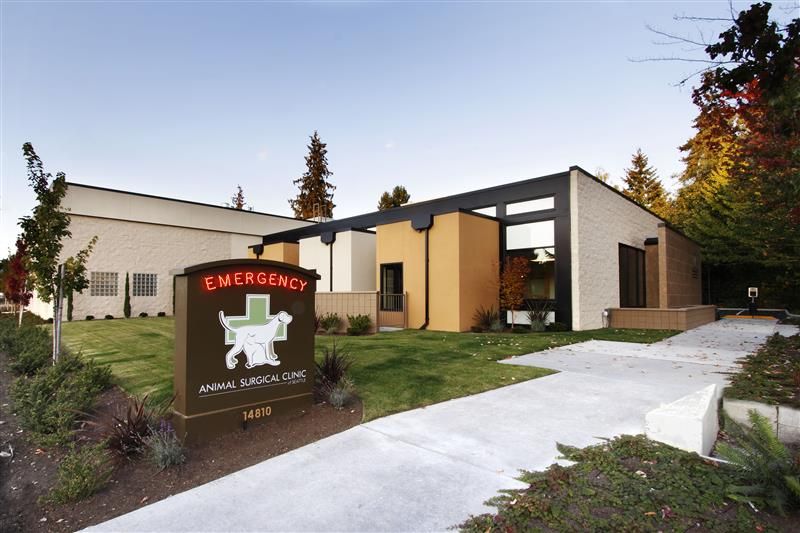
A strategic hospital layout is essential for ensuring an efficient, less stressful veterinary emergency case. (Photo courtesy of the Animal Surgical Center of Seattle).

It’s no secret that emergency veterinary cases are highly tense situations, particularly when an ill patient is being rushed through your doors and transported to an appropriate treatment space. Accompanying them at these times are frantic owners, leaving the team dashing around trying to put out all the fires. If the layout of your hospital is insufficient for these hectic scenarios, it can create a very stressful environment for everyone involved. However, by incorporating a few simple design concepts, you can help mitigate these stressors and increase efficiency and productivity for emergency cases.
Clear signage
It starts from the moment a client pulls into the parking lot. Upon entering your site, they should be able to spot and read clear signage that directs them to the correct parking spot for unloading. Remember that owners are often rushing and stressed when their pet needs emergency care and the last thing they want to do is search for the emergency department. The quicker they can read your signs and get to the correct area, the quicker you can begin medical treatment on their pet.
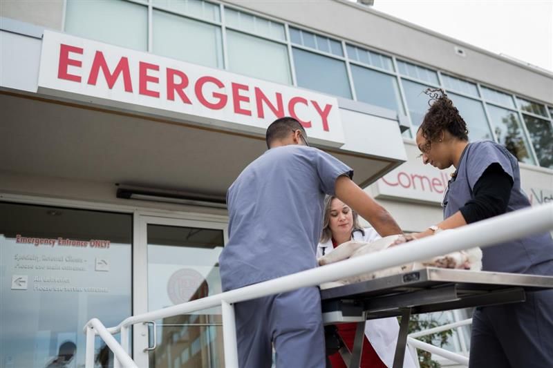
The “Emergency” sign should be easily identifiable so clients can quickly get to the appropriate area and their pet can receive care. (Photo courtesy of Cornell University).

The signage should also be well lit and bright in both daytime and nighttime settings. It should be easy to read with large letters and clear, concise messages. The color of the sign should be bright and bold, and contrast with whatever background you’re using. The most common design typically includes a red sign with white letters that says, “EMERGENCY.” The color red itself has psychological associations with feeling high risk and needing urgent attention.
Finally, the placement of the sign is important. It should be highly visible and clear of obstructions so that clients don’t miss it. A couple of good placement options for signs are either up high on the building or a monument-type sign as people drive in.
Designate drop-off spaces
Allocating a designated drop-off area for emergency cases is essential for emergency practices. It gives clients a place to stop and unload that is conveniently located near the entrance to the hospital, and it prevents people from having to park far away and potentially carry a large, immobile animal from their car to your front door.
Drop-off spaces can be as simple as 1 or 2 designated parking stalls near the entrance, or they can be as extensive as a porte cochere covered drive-through right by the front door (like a hotel where people temporarily park while they check in to their rooms), where clients can temporarily park while they bring their pet inside. Again, whichever you choose should be clearly labeled with easy-to-read signage.
Emergency greeter stations
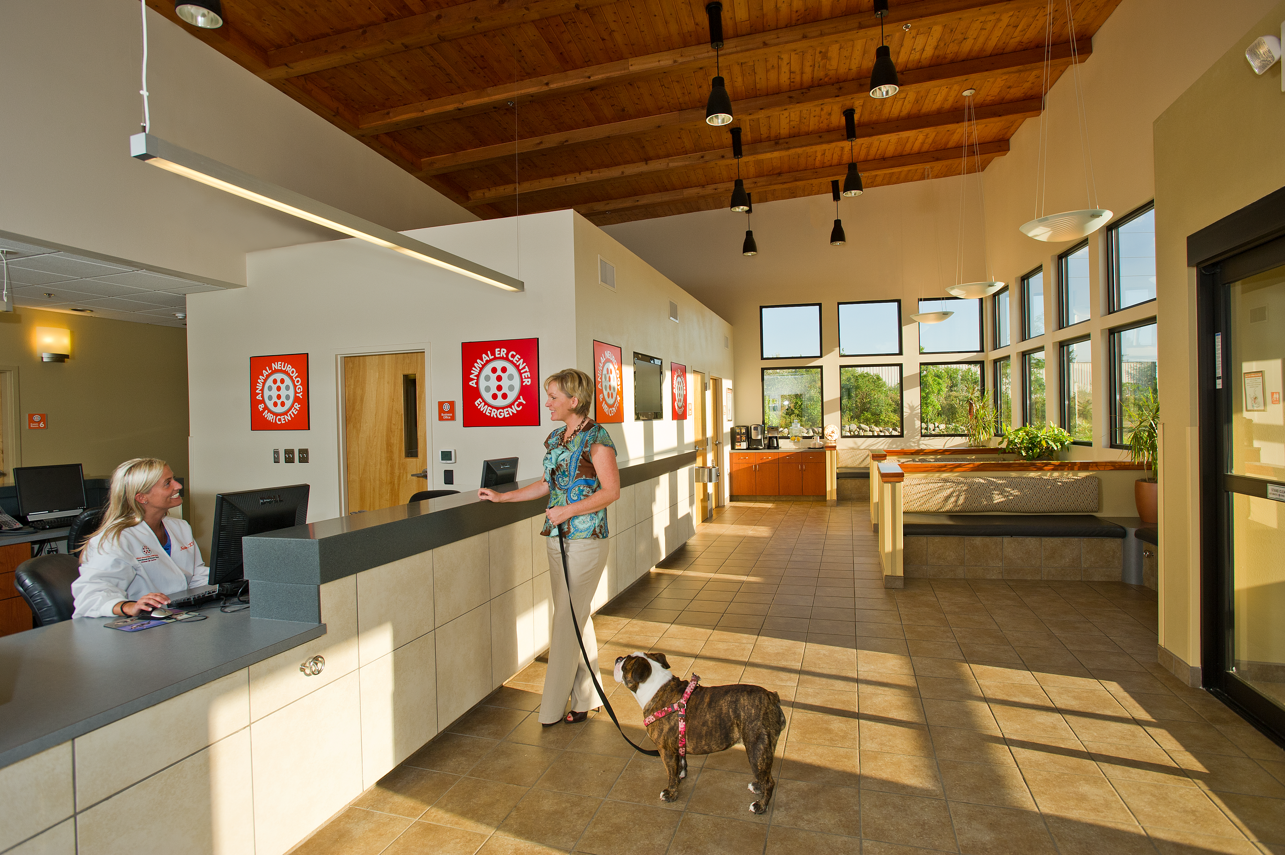
If possible, designate a workspace for staff members to greet emergency cases as they arrive. For many of my emergency hospital projects, I often design larger than normal entry vestibules to allow greeters to be stationed just inside the first set of entry doors. These greeters will often have a small kiosk or desk that they can sit or stand at in between drop-offs, and large windows surrounding them to clearly see as clients pull up. There is also a space for a gurney to be parked nearby that greeters can quickly grab when they need to run out and help a client with their pet.
Emergency greeters are often perceived as an added level of care to pet owners who might not know what to do in emergency drop-off situations. The greeters are there to immediately respond to the pet owner, helping their pet get the attention they need, answering questions they might have, and directing them to the correct place to go before they’ve even entered the front doors. It’s a hospitality-type service that goes a long way in making pet owners feel more comfortable and taken care of.
Direct paths to medical spaces
Once an emergency case has entered the hospital’s front doors, it’s imperative to get them to a treatment space as quickly as possible. The path from the front door to the treatment area should be straight and direct. If the path to a treatment space is inconvenient or too long, it can cause unnecessary delays. There should be minimal corners and turns to navigate, as well as minimal doors to open and close. The width of the hallway should be wide enough to allow for a gurney and 2 people on either side to easily pass through; 5 to 7 feet wide is typically a good rule of thumb. Some other beneficial features to include in emergency hallways are automatic door openers to quickly and easily open doors when passing through and wall guards or bumpers to protect the hallway walls from rushing gurneys.
Triage exam rooms
Triage exam rooms are the first response station in emergency hospitals. They are essentially a special-use exam room that serves as the first stop for emergency care. Clients will often accompany their pets into a triage exam room along with a doctor. These rooms give the doctor a private space to evaluate the severity of the situation, provide immediate medical treatment if needed to stabilize a patient, and discuss options with the client for how to move forward.
The difference between triage exam rooms and standard exam rooms has to do with the way they are outfitted. For example, triage exam rooms generally need more cabinetry than standard exam rooms because they need more storage for treatment supplies like intravenous equipment, syringes, bandages, and more. They also typically have a gurney or rolling table as the exam surface instead of a fixed or folding exam table to allow for mobility, and there is often more open floor space for emergency-type equipment such as crash carts. Some veterinarians also choose to incorporate medical gases into triage exam spaces such as oxygen.
Small considerations with big impact
Obviously, getting an animal from a client’s car to a medical space is just the beginning of emergency veterinary care, but it’s arguably one of the most important steps to ensure successful treatment and satisfied clientele. If you can ease the stress of those first few moments in emergency cases, you can set the tone for the entire emergency experience.
Using design methods to simplify the process of emergency care helps satisfy the client and ensure effective treatment. (Photo courtesy of the Veterinary Medical Center).

As the Director of Design with BDA Architecture, Becky Gasser has more than 10 years of experience designing animal care facilities across the United States. Passionate for both animals and architecture, she has been the lead designer on several award-winning veterinary hospitals.
