A gutted building finds new life
This California practice turned warehouse-sized space into wow.
Dr. Mona Rosenberg at City of Angels Veterinary Specialty Center knows oncology. And she was good at running her standalone oncology practice—the business was a success. But because she didn't have enough space for her practice to be the comprehensive cancer center she'd dreamed of, she started searching for a new location. However, in Southern California there isn't a lot of land up for grabs. So she worked with her Realtor for several years until they found the perfect space in Culver City, Calif.

Art in the park: Sculptures at City of Angels Veterinary Specialty Center add an interesting visual element. Artificial grass means there are never any brown patches, but Dr. Mona Rosenberg does have a team member patrol and hose down the area daily. (Photos by Glenn Cormier/Ben Carufel: Insite Architectural Photography)
The gutted 30,000-square-foot building was a bit large to house just a cancer center. And at the time, the area had a reputation of being less than desirable. Dr. Rosenberg wondered if she'd be able to attract new clients to the area. So she began talking with other like-minded business owners. It made sense to her to partner with other specialty veterinarians so they could come together under one roof and form a large specialty facility. "It made sense," she says, "because they each know how to run their specialty practice successfully." So several specialties came together under one roof, each a separate practice and business. Each practice has its own mission statement and core values, but there are also core values that govern the entire facility. "We wanted a functional space," Dr. Rosenberg says, "and we wanted to stay true to the fact that we're separate businesses that work together."

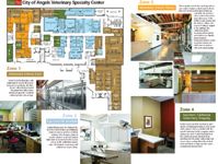
Floor Plan: City of Angels Veterinary Specialty Center
She took a chance on the location and it paid off. Over the last five years the city has grown and gentrified, and now Culver City has a reputation for being hip and up-and-coming. The old brick building fits in with the neighborhood nicely. "When we found it, it was already a super-cool-looking facility," Dr. Rosenberg says. "It was a blank canvas." The building had been gutted, so there were few walls inside. And for the most part, the concrete flooring and open truss ceilings stayed in place (except where sound abatement was necessary) during renovation.

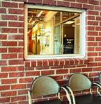
An inside look: An interior brick wall with a window provides lines of sight into a client area with a coffee bar and vending machine.
Catering to clients
The U-shaped floor plan is perfect for the group's business model: Clients walk into one entrance, but each specialty group has its own reception area, just like a human hospital. The front end of the building is divided into pods, but the back area is open to keep everything flowing between the medical teams from each practice.
Each practice provided input on how much square footage it would need, and the designers took this into consideration when they created the floor plan. Each group also designed its own exam rooms, so the exam rooms are all a little different. "The designers spent a substantial amount of time interviewing us and watching us work in our previous facilities," Dr. Rosenberg says. This helped them come up with a plan for everyone—including the facility's clients.

A look at the numbers
Clients park on the roof of the building and descend via elevator into a courtyard covered with artificial grass and dotted with sculptures. Culver City requires that any new business spend 1 percent of its construction budget on exterior art. "It's a great idea," Dr. Rosenberg says, "but when you're trying to stay within a budget, it's an added expense."

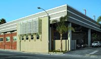
Curb appeal: The City of Angels facility is located in a modern, industrial area, and the owners wanted to retain some of that look to ensure that the building would fit in with the rest of the neighborhood. Metal, brick, and wood elements accent the building, where clients park on the rooftop and descend into a courtyard near the main entrance.
Dr. Rosenberg and her group wanted an upscale, comfortable space where clients would feel welcome. "Nobody's coming to our facility for vaccinations," she says. "People come here because their pet has a serious or life-threatening condition." The challenge was keeping the industrial feeling of the building, yet softening it so that it felt warm and inviting.

The challenge in this area is making sure the artificial grass in the courtyard stays clean and odor free, Dr. Rosenberg says-the oncology practice alone sees about 800 patients a month.
To help create that inviting look, Dr. Rosenberg displays her personal modern art collection throughout the hospital. "I love having my art on the wall and sharing it with others," she says. With the mix of industrial yet welcoming elements, the whole team is ecstatic with the way things have turned out. "The staff is so proud to work here and they take ownership in taking care of the facility," Dr. Rosenberg says.