Paving his own path
Pet Medical Center of San Antonio doesn't abide by many design rules, which suits this practice crew perfectly. A creative approach helped this doctor create a comfortable, convenient hospital for clients, patients, and staff members.
When it's time to build, most veterinarians spend hours researching the financing, zoning, and building process. They obtain sample floor plans from other veterinarians and architects, pore over the details, and follow proven "prescribed" plans. Not this doctor.

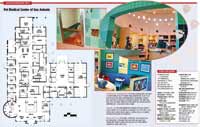
Set in an industrial park, the hospital stands out with clean lines, multiple colors and textures, and a silo structure that makes the building easily identifiable.
Dr. Scott Weeks, the owner of Pet Medical Center of San Antonio, approached the building process—and the facility itself—in a less conventional way. "From beginning to end, I was clueless," Dr. Weeks says.
By his own admission, Dr. Weeks didn't know the first thing about securing financing or deciding how large a structure he could afford to build. And really, he said, he didn't need to know; he just needed trustworthy people to figure out these important details. This allowed Dr. Weeks to focus on putting the hospital together in a way that made sense for him.
And as a Merit Award winner of the 2005 Veterinary Economics Hospital Design Competition, Dr. Weeks evidently made his system work. In fact, one competition judge even commented, "Dr. Weeks' different design was well developed to match his different practice philosophy."
Forming a plan
To get started, Dr. Weeks sought help from a financial planning company that works with veterinarians. There, two experts helped him figure out how much money he could safely borrow; how big he could afford to build; where he could borrow the money; and the number of exam rooms, cages, and runs he needed to maximize the facility's potential. The best thing, Dr. Weeks says, is that these professionals even submitted his loan requests and filled out the paperwork for him.

"I really wanted to focus on getting my dream hospital, not on paperwork and financial details," Dr. Weeks says. "Hiring competent people whom I trusted freed me to do my job."

Dr. Weeks' job was to take care of his current practice, which he has owned since 1991, and to decide what he wanted his new practice to look like. "Since I started with the practice in 1988, I'd kept a running list of features that I wanted and didn't want in a hospital," he says. "I knew I'd build a facility someday, so I tried to keep notes of what worked best, such as larger waiting areas with comfortable seating—even for multiple clients—and separate office facilities for associate veterinarians."

Shaking things up
Dr. Weeks said he never thought about how standard practices were designed or that there were supposed to be certain zones. "I just had my own ideas of how I thought things should flow," he admits. And the design of Dr. Weeks' new facility reflects that independent thought.

Creative advertising:
For example, instead of using a typical front/middle/back design, Dr. Weeks wanted a two-zone hospital that combined animal wards and the clinical area in one zone. This approach put the cat boarding area up front—so pet owners can see boarded cats from the waiting area. The dog wards lie just beyond the cat boarding at the front of the hospital.
"We have a big boarding business, and we decided to make it easy on ourselves and our clients by putting boarding wards up front," says Dr. Weeks. "Our architect never said 'that's not the way to do things.' He just listened and made it happen the way I envisioned it. Now team members have easy access to the boarding area from the reception desk. And we don't make clients traipse through the entire hospital to visit or retrieve a pet."
Dr. Weeks finds that this arrangement has worked well, and he's even thinking of making the boarding side a separate business. "We already have staff members who work solely in the boarding area, with a boarding manager greeting clients and admitting pets," he says.
To minimize noise, the cats are located nearest the waiting area. And two well-sealed doors separate clients who are waiting from boarded dogs, which also helps control odor. "Besides being convenient, having the pets up front showcases the great care we give pets when they stay with us," he says.
The silo feature represents another design departure. "I wanted my building to stand out," says Dr. Weeks. "I visited another Hospital Design Competition award winner, Meadow Hills Veterinary Center in Kennewick, Wash., and they mentioned that their design has made the hospital an area landmark. I wanted that for my building."
A bank in town had always caught Dr. Weeks' eye because of a unique design feature: a silo. "I thought that if the silo catches my eye, surely it will catch the eye of my clients. So I decided I wanted a silo on my building, too," he says.
Here, Dr. Weeks had to stand firm with his architects. An original draft of the hospital plans omitted the silo feature. The architects said it was just too expensive to build a round structure. Dr. Weeks insisted, and ended up cutting here and there to make the silo fit. And he's glad he did; Dr. Weeks uses the space, which sits just off the reception area, as a client-education center and retail center.
Focusing on service
"Clients who see me already expect high-quality veterinary care," says Dr. Weeks. "I wanted to offer them the extras, the good things they don't expect. Every little touch I added helps reinforce the idea that I care for them and that our entire team will treat them well."
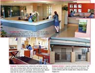
For example, the client hospitality station in the reception area serves hot coffee and fresh-baked cookies. And staff members work to make clients comfortable, even offering soda and bottled water.
The children's nook is yet another example of the steps Dr. Weeks took to meet clients' needs. "Parents love this area," continues Dr. Weeks. "I want our practice to be family friendly, so I created an area where kids can play and watch television while mom or dad's in the next room."
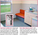
A window from the kids' nook into the neighboring exam room provides visual contact. And if parents must use a different exam room, they can keep an eye on little ones by using a closed-circuit monitor. The monitor also serves another purpose: It provides a virtual tour of the hospital.
"Throughout the practice, we focused on offering the little things that make clients feel well-cared for and comfortable," Dr. Weeks says. "If parents feel at ease having their children at the practice, it frees us up to talk about the pet's medical care without distractions."
Sarah A. Moser is a freelance writer and editor in Olathe, Kan. Please send questions or comments to ve@advanstar.com