Small space? Limited budget? Think big!
The careful design of this 3,010-square-foot hospital and the luxurious finishings belie the small footprint and reasonable price tag.
One six-hour drive in the spring of 2001 changed the way Dr. Brad Rosonke practices medicine. During a weekend getaway for relaxing and rejuvenating with his wife, Cathy, Dr. Rosonke hammered out nearly all of the details of building their own practice. "We always knew we'd own our own business someday, and on our trip I mentioned that it's something I'd love to do soon," says Dr. Rosonke. "So Cathy and I made a list of 30 things we'd love to see in a hospital from our point of view and from a client's perspective. Then there was no turning back."

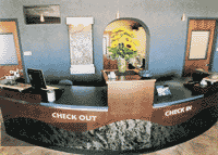
Adding curves to the reception desk, ceiling treatment, and doorways maximized visual interest in the reception area. A fountain featuring the hospital logo adorns the wall behind the front desk.
The Rosonkes returned from their trip and made a flurry of phone calls. Two years later, Hillside Animal Hospital in Scottsdale, Ariz., opened. And the owners' intention to please clients and team members with a clean, airy, and comfortable practice served them well, attracting new business and earning them the honor of the Best Small Hospital in the 2005 Veterinary Economics Hospital Design Competition.
Client-focused design
"If a question came up regarding any part of the practice, we'd ask, 'What would our clients want?' to make a decision," says Cathy Rosonke, the hospital administrator. "We really got to know the people we'd be serving, and we took every opportunity to interact with our neighbors. That helped us make our practice the kind of place they'd want to visit."

Treats wait at the reception desk for after-exam rewards.
To better understand their potential clients, the Rosonkes conducted dozens of interviews with area pet owners. "We heard one request loud and clear: Clients want to take their pets to a clean veterinary hospital that doesn't feel impersonal or claustrophobic," says Cathy Rosonke. "They obviously relate the interior design, employees' appearance, and the hospital smell directly to their perception of the quality of care their pets would receive."
The couple also designed the inside of the practice to look like the homes in the area. "Our hospital might look different from other practices around the country, but the color and design style reflect the homes in the neighborhoods around us," says Dr. Rosonke. "To project a homey atmosphere, we needed to be like the homes we serve."

Award-winning floor plan
Area model homes, spas, and resorts served as inspiration for the colors and earthy textures used at Hillside Animal Hospital. Other luxurious touches include transom windows in the exam rooms, large windows in the manager's office and surgical suite, premium chocolates and coffee served in the reception area, an upscale pet boutique, several fountains, and soothing background music.
Master of illusion
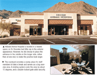
The Hospital Design Competition judges commented that the practice appears much larger than it is through the use of a creative layout, wise door placement, and other design tricks. For example, instead of building the practice narrow and deep, with the entrance at one end, Dr. Rosonke chose to set the practice up wide and shallow, with the entrance in the middle of the longer side. "This orientation makes the practice look larger," Dr. Rosonke says.

Know what you want before you start
The Rosonkes also used curved ceilings and archways, which Dr. Rosonke says gives a warmer, more spacious feel than squared-off edges. And natural light and rich colors make the small space feel larger and more comfortable.
Another room-opening trick: Use half doors where possible. "We like to bring our own pets into the hospital, but want to keep them separate from potentially sick animals, so we installed Dutch doors in our offices and the employee lounge," says Dr. Rosonke. "This approach also makes the practice seem more spacious."
In fact, Dr. Rosonke minimized physical barriers throughout the hospital to maximize the space's flexibility. For example, in the Peticulars pet boutique, Cathy Rosonke purposely bought individual pieces of furniture that could be moved-and removed-as needed. "Now, if we have less inventory, we can put in more furniture to make the room feel fuller," she says. "Or if we need more space, we can remove a few pieces to clear a walkway or open the room up a little. It's a great space-saving trick."

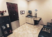
Each of the three exam rooms features a computer, a couch or bench, granite-style Formica countertops, and three-foot-high stainless steel kick plates on the doors to protect them from active pets.
Cutting costs the Costco way
With the 2005
Veterinary Economics
Hospital Design Competition award-winning hospitals paying on average $2 million for a new facility, Hillside Animal Hospital holds down the low end of the curve at $422,000, including the facility, improvements, professional fees, furnishings, computer systems, and equipment. The secret to living large on a shoestring budget? Bargain shopping.
"I had the luxury of time to find the right pieces at the right prices," says Cathy Rosonke. "We shopped consignment stores and scoured for bargains when it came to furniture. Combining bargains with a creative eye can make a nice building look so much better."

(Above) Hillside Animal Hospital is located in a leased space, so Dr. Rosonke had little say in the exterior appearance. However, he did choose to place the entrance in the middle on the longer side, rather than at one end, to make the practice look larger. (Below)The courtyard provides a sunny place for staff members to take a break and serves as a dog exercise area. A misting system cools the area by about 15 degrees, and a double-locked gate adds security.
The couple also used rich colors and textures to set a mood without busting their budget. "To paint a room with a blue faux-suede paint costs about the same as painting the room white but gives the space much more character," Cathy Rosonke says.
Most people know the benefit of shopping at large wholesale warehouses for economy-size packages of toilet paper and cleaning supplies. Dr. Rosonke took Costco shopping to a new level: He bought items there to organize his surgical suite at a fraction of the cost. "We set a budget, allocating more money to areas where it counts, such as the reception area and exam rooms," says Cathy Rosonke. "For instance, we put nice chairs in the exam rooms and slightly less-nice chairs in my office to save a little money. I hit sales and found a furniture company going out of business, so we were able to buy a table for the lounge for next to nothing. My full-time job at the time was building this hospital, and that helped us do the project well for less."

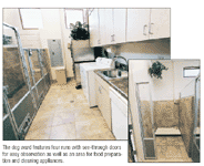
The dog ward features four runs with see-through doors for easy observation as well as an area for food preparation and cleaning appliances.
Their careful spending and clients' enthusiastic response is yielding a terrific outlook. "In our first year, we exceeded our financial goals, and we already received accreditation from AAHA," says Dr. Rosonke. "We attracted great staff members, and we hope to attract a great new associate. Candidates come to interview and fall in love with the hospital. I'm glad they see we've built a good place to work with a great environment."
Sarah A. Moser is a freelance writer in Olathe, Kan. Please send questions or comments to ve@advanstar.com