A warm reception
Your clients are guests in your practice. So treat them to an experience they deserve.
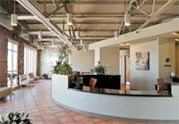
Retro style: The building that houses Everhart Veterinary Hospital was originally constructed in the 1920s as a Buick dealership. Liking some elements of that look, the hospital owners and architects tried to maintain the industrial style while creating a state-of-the-art veterinary hospital. The brick wall was treated with an oil-based sealant to block dust, moisture, and odors. The exposed ceiling and ductwork are in keeping with the industrial feeling.
Everhart Veterinary Hospital, Baltimore, Md. 2008 Merit Award Winner, Photo by Ron Solomon
Lush greenery: A planter built into the reception counter breaks up the long space and gives receptionists some privacy. The plants also help refresh the air naturally.
Color scheme: The porcelain tile is impervious to odor and the terra cotta shade helps hide dirt. Neutral earth tones in the hospital's color palette create a relaxing environment and soften the building's industrial feel.
Workspace: The front desk features multiple elevations to make interaction between team members and clients easier. A wall separating check-in and checkout areas allows clients to privately discuss financial or medical matters with the staff. The work island located behind the reception desk stores important documents and medications waiting for client pickup. The island also helps keep the main reception counter clutter-free.

Illustration by Gail Armstrong.
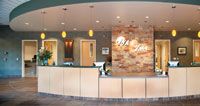
Bring the outside in: The deep, earthy colors and rugged pattern on the durable ceramic tile flooring and vinyl wall covering create a tranquil mood. Pendant lighting casts a soft glow and focuses light onto the writing surfaces. Recessed and natural lighting keeps the area amply lit. Behind the reception desk, a hanging fountain and a stone accent wall add warmth and create a relaxing environment for clients, patients, and team members. The hospital's owners believe that these natural aesthetics go a long way to reducing burnout, decreasing employee turnover, and improving the team's performance.
Veterinary Surgical Associates/Veterinary Medical Specialists, Campbell, Calif. 2008 Merit Award Winner, Photos by William Porter. Photo by William Porter.
Generous space: The reception area in this practice is huge, taking up 1,100 square feet of the 13,000-square-foot hospital. It's also strategically shaped—the half-moon curve serves as the gateway to the rest of the facility. The exam rooms, medical records room, and the pharmacy nestle behind it.
Welcoming looks: The lower level of the reception counter lines up directly with the hospital's front doors. This ensures that team members have a direct line of sight when greeting incoming visitors.

Photo by William Porter.
Feels just like home: Behind the front desk, the carpeted floor enhances team members' comfort and helps reduce noise levels. The bold pattern helps hide dirt and stains. Extra storage space housed in this area keeps office supplies organized.

Photo by William Porter.
A soft spot: Plenty of cushioned bench seating allows clients to spread out and relax while they wait.
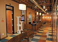
Forget the dogs: The owner of this cat clinic wanted the public areas of the hospital to be warm and inviting, and carpeting was an integral part of that design strategy. Carpet in a pattern called "House Pet" warms the paws of the six clinic cats—and feels like home to visitors with two legs as well. Since no adhesive is used to install the carpet, the durable tiles are easy to care for. Individual tiles can be picked up and scrubbed off in the sink, or they can be replaced one at a time as needed.
City Cat Clinic & Condos, St. Louis Park, Minn. Photo by Pavel Romaniko.
City dwelling: The clinic's location and name inspired the subtle urban theme. Leaving the ductwork exposed saved on construction costs and helped create that urban look. To soften the look, walls are adorned with framed prints of cats as well as commissioned watercolor paintings of the clinic cats.
Visual access: The glass-backed boarding area lets natural light into the reception area, where waiting clients can watch the boarding cats' antics. This exterior facade within the clinic separates the boarding area from the rest of the clinic, yet keeps the boarding area visually accessible.
Cats just wanna have fun: Designed by the clinic's owner and given two paws up by the clinic cats, the condos are designed to meet cats' every desire. The high perches, enclosed sleeping areas, TVs with bird images, and food bowls and litter boxes placed at least 20 inches apart help reduce cats' stress. A playroom located in the front of the boarding area along the storefront gives cats a place to stretch their legs and entice passersby. Bench seating in the waiting area gives clients a place to relax and watch the entertainment.
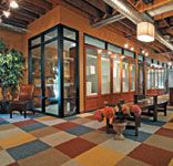
Photo by Pavel Romaniko.
Knock on wood: This clinic is located on the edge of the Adirondack Mountains in upstate New York. To fit in with the traditional architecture of the region, the hospital's owners wanted a durable, yet natural look. To accomplish that goal, the reception area incorporates an earthy theme with a vaulted wood ceiling, exposed wood beams, and earth tone porcelain tile floors. The hand-painted mural creates a focal point and brings a touch of whimsy to the reception area. To soften the din caused by some of these hard surfaces and open spaces, an acoustical wall covering is used.
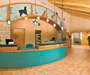
Ballston Spa Veterinary Clinic, Ballston Spa, N.Y. 2008 Merit Award Winner. Photo by Randall Perry.
Small details: Signs posted on the front desk point clients to the cat and dog waiting areas. Separating waiting pets by species helps keep the peace. Hooks attached to the front of the desk serve as convenient leash holders when clients' hands are full.
Special spot: A kids' nook nestled between two exam rooms is stocked with games and toys to occupy the little ones. The surrounding exam rooms feature windows that peek into the playroom so parents can keep an eye on their children.
Bright lights: Uplighting highlights the ceiling's wood beams and adds architectural interest to the space. Double doors maintain a smooth flow of traffic and let the light in.
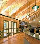
Photo by Randall Perry.
Built to last: The reception area is filled with durable materials such as a Corian solid-surface counter top, a glazed tile wainscot, and porcelain tile with epoxy grout.
Client service: As clients enter the hospital through an air-lock vestibule, they check in at the greeter's station. All transactions at this hospital are handled in the exam room. So instead of a traditional reception area, this space serves as a greeter and check-in station. This reduced the need for a large, imposing reception desk, which keeps the space open. From the waiting area, clients view the boarding and training areas through large windows. The glass-backed feline boarding condos are visible directly behind the greeter's desk through square windows.
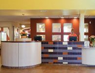
South Suburban Animal Hospital, Perrysburg, Ohio 2007 Merit Award Winner. Photo by Gary Easter.
Accent color: The careful use of bold color provides visual interest to the space. Instead of painting the walls all the same shade, designers used several colors to create a perception of richness and depth. Designers also played with color choice on the accent tile that catches clients' eyes as they enter the hospital. The tile also guides them toward the greeter.