Creating exceptional lobbies and customer-care areas
How veterinary practices can up their game on lobby and public area design
One of the things on my mind recently is how to design spaces to help veterinary practices serve clients better. This is especially important in today’s market, where more demand is placed on veterinary professionals than they can readily handle, and where veterinary medicine is continuously evolving to meet those needs. Space design is only part of the answer, and the bigger picture is about creating happy clients and providing great care to their pets, which lead to thriving veterinary practices.
Time is precious
Imagine you are in the drive-through line at your favorite coffee shop. There are 3 cars ahead of you and someone orders several complicated coffee drinks for their office mates. As employees of the coffee shop rush to catch up, the line has become impossibly long, and customers are becoming annoyed. This causes prolonged pressure on the employees inside the store.
This is the type of problem that can be solved with a new approach, such as designing for 2 drive-through lines, designating a side waiting area where a customer with a large order can park so the rest of the queue can advance more efficiently, or encouraging online orders, so the shop can prepare customers’ orders ahead of time.
Waiting in a veterinary lobby is very similar to waiting in an inefficient drive-through line. Waiting offers no benefit to the client and can cause more stress for their pet. When planning the design and operation of your practice, consider that time is precious for everyone.
Here are just a few ideas to save time and create better customer service.
Trade lobby space for exam space
Once the client is in a room, at least they have been processed, which means that easy tech appointments can keep rolling, while the doctor is tied up with the high-needs client and their ancient, medically complex pet. This is the veterinary equivalent of the complex coffee order.
Boost technology options
Clients who can sign in, pay, and authorize care on their smartphones can do that from anywhere, which means desks can be smaller, and fewer people will be milling around in your lobby.
Make waiting an intentional and comfortable activity
If a client wants to wait for their pet to receive care or if you have the type of practice where long-term waiting is normal, such as an emergency practice, then make waiting special. Design long-term waiting space that has Wi-Fi enabled, comfortable seating, coffee available, and is quiet and aesthetically pleasing. This can be off to the side of the main hospital entry, so it is out of the flow of activity.
Design for the practice you want it to be
Do your customer-care spaces and exam rooms read as visually cluttered? Are they disorganized? Are they inefficient? Are they dated? No one wants to reflect these impressions because they are not representative of who you are. They don’t reflect the quality of care you provide to clients and pets; it’s just how things have evolved. Take the time to clean up and professionalize all the front-end spaces of your hospital and show who you really are when taking care of clients and their pets. If you’re designing a new hospital, this is your opportunity to decide how your values will be reflected in your customer-care areas.
These are some of the wonderful trends we are seeing in lobby and exam room design.
Emphasis on professionalism
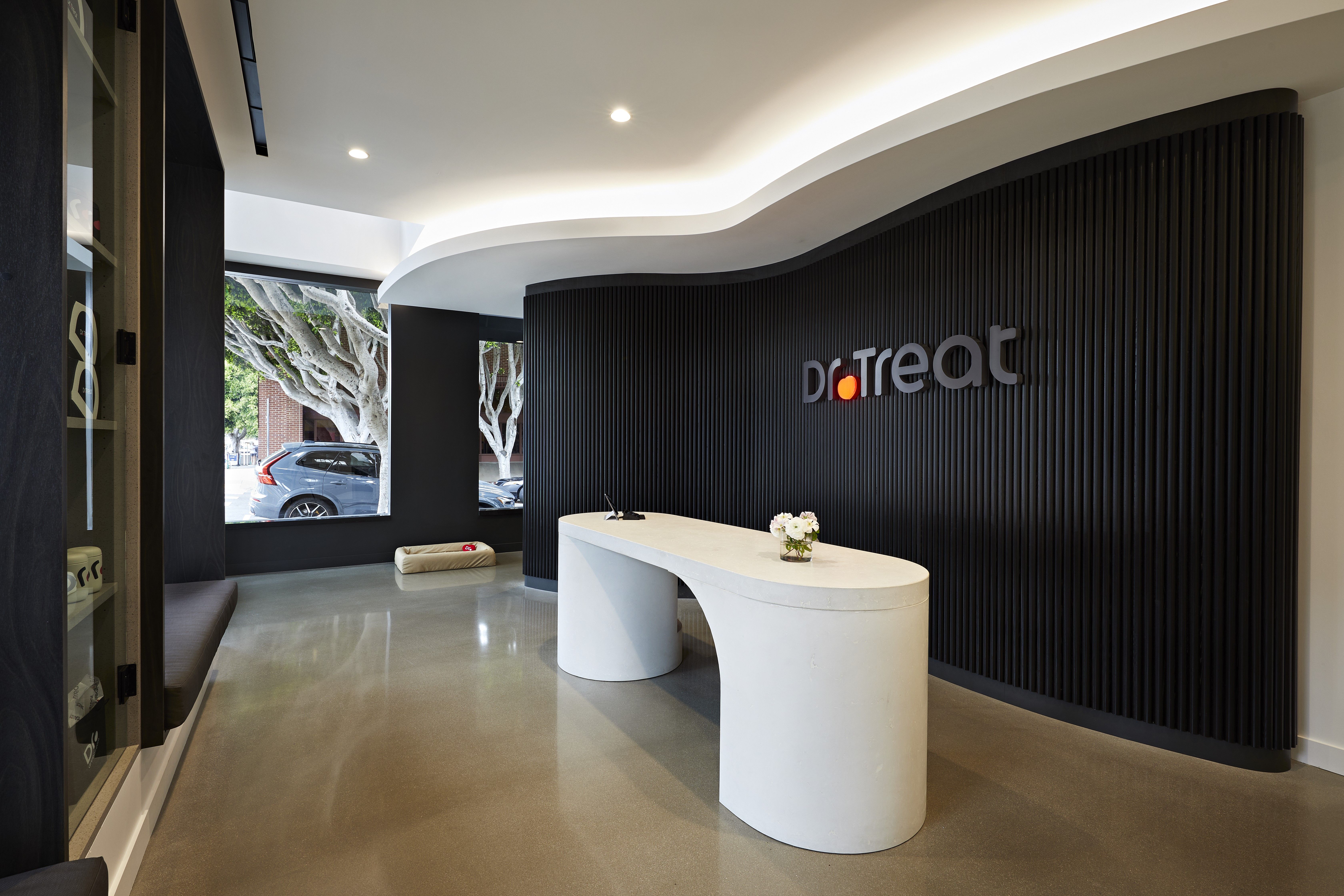
Use branded colors, branded graphics, and very carefully chosen signage, furnishings, and desk design. You do not have to spend more money on construction to be more thoughtful, but you may need to spend more time on the front-end design. Your bespoke hospital interior will reflect that you are highly professional and intentional in all that you do.
Photo courtesy of Dr Treat Veterinary Care.

Clean and decluttered
This has not gone out of style now that minimalism has faded because it is still important to keep a space clean and decluttered. Do not accumulate clutter and create tidy customer-care areas. Desks should be free of piles of paper. Advertised services and products should be carefully and thoughtfully displayed. Signage should be minimal, and seating areas should be clean. One tip is to keep decorative items on shelves on walls where they can be cleaned, rather than at floor level, where they accumulate dust and dirt. For example, a pretty plant on a wall shelf can be dusted more easily than one in a big pot on the floor.
Comfortable, not clinical
A great example of this is with furniture. Human health care has helped create a market for furniture that is beautiful, inclusive, easily usable for people with a variety of body types and abilities, and highly cleanable. Do not purchase hard plastic chairs if you’re trying to put clients first. Purchase the type of seating you find comfortable and would want to sit on.
Soft and whimsical
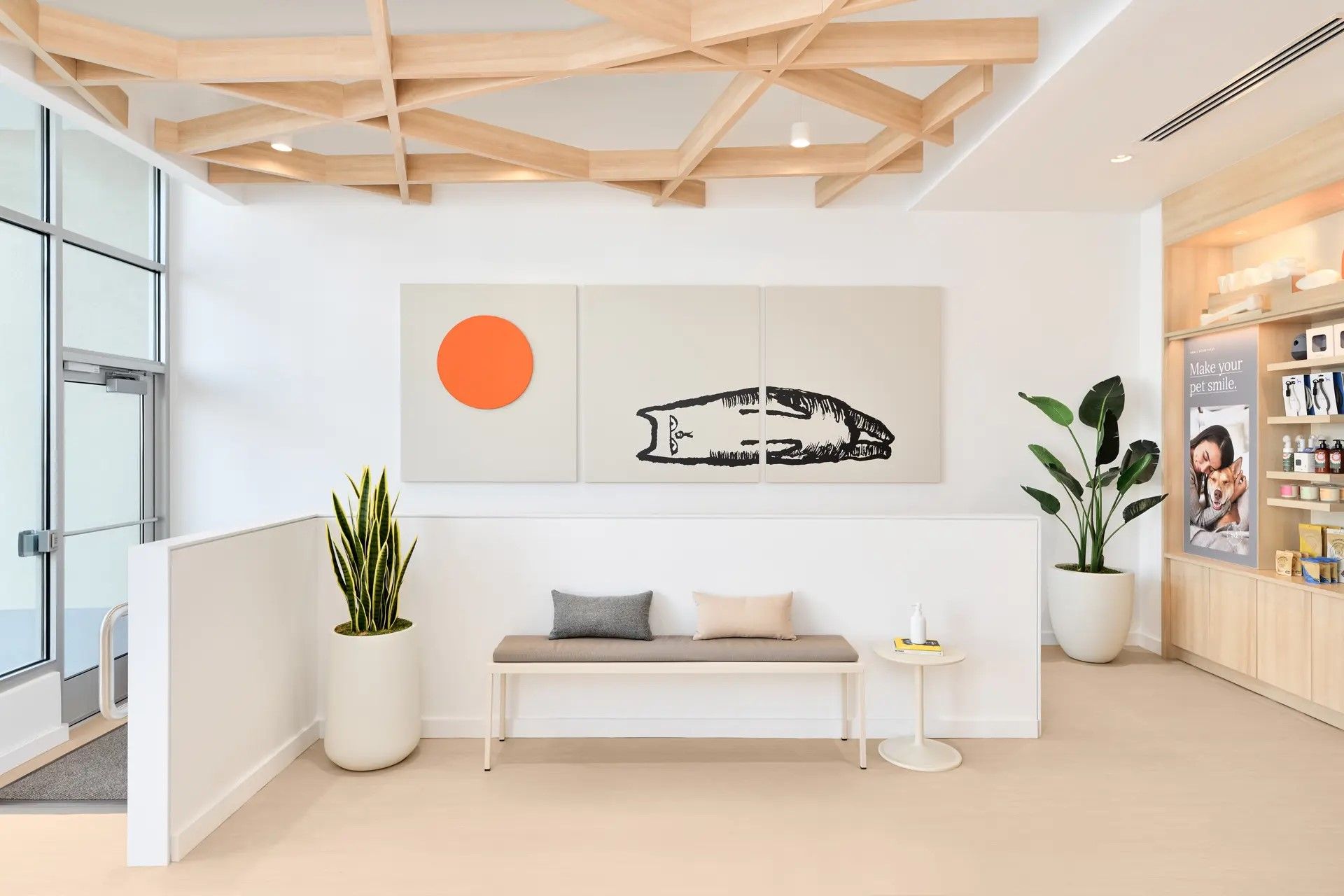
One concern about highly professional spaces is that they trend toward a sterile impression. This is why many of our corporate clients and private practice clients have introduced homey touches and whimsical items, such as artwork that makes people smile.
Photo courtesy of Small Door: Newton Centre – Boston, Massachusetts, Photography: Greg Moine, Illustration: Jean Jullien

Creating an outdoor space
An outdoor space can be much more pleasant for clients than a crowded lobby. If you want to create the impression of kind care delivered in a calming and destressed environment, having indoor/outdoor client areas and exam rooms can help reinforce this value.
Really, really simple
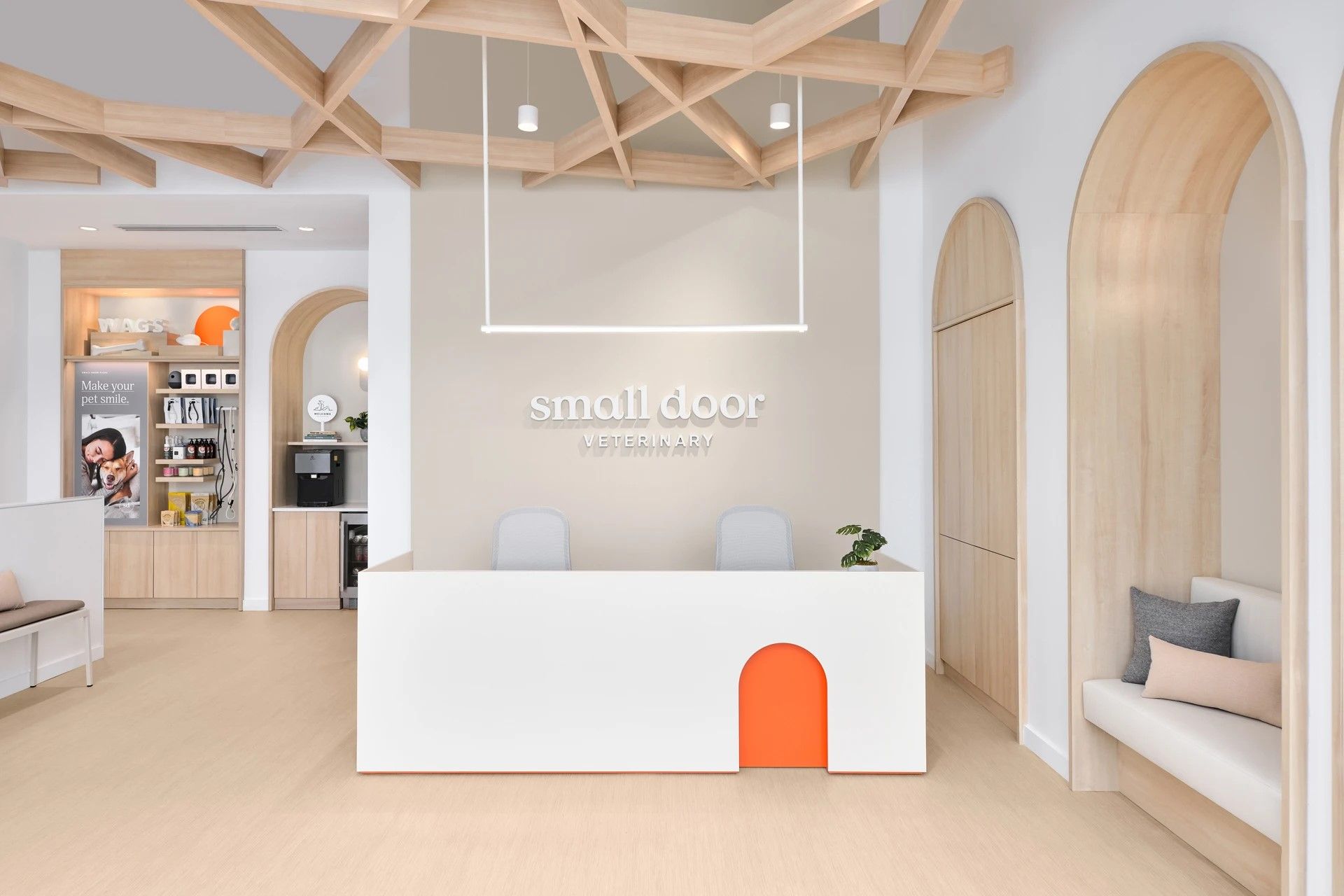
Photo courtesy of Small Door: Newton Centre – Boston, Massachusetts, Photography: Greg Moine

If you look at architecture magazines or the beautiful designs of new corporate hospital lobbies, it may seem that customer care is an arms race, with the hospitals that create the fanciest lobbies as the winners. However, a key factor in designing a beautiful but affordable hospital is to keep it simple. Here are several traditional features that you can do away with:
- Child play areas. These are germy, and every parent has an electronic device. It’s fine not to have a play space in your lobby.
- Retail. Unless you have the rare practice where retail makes money, such as a rural hospital where clients still come in to purchase supplies, then eliminate retail. If you do have retail, just a very small, thoughtful display is usually enough. Do not store products in the lobby.
- Vaulted ceilings. Save thousands of dollars on cathedral ceilings and focus instead on the most beautiful color of paint, signage, a feature wall using a graphic or tile, and a stylish light fixture. This is enough, and it costs way less money than fancy architecture.
- Free decor. Don’t put up the flea-and-tick-prevention signage and other flotsam of free decor that your vendors send you. Everything you design and communicate should be curated.
- Other expensive items such as fish tanks and huge TVs are unnecessary and do not need to be purchased and/or maintained.
Design around the relationship
I love that today’s veterinary architecture is about building and supporting functional relationships between people. Happy clients and pets make for a happy practice. Do away with the traditional trappings of lobbies and exam rooms. Pare down these spaces and keep them simple, intentional, beautiful, and professional. Use everyone’s time as wisely as possible by doing away with waiting for waiting’s sake. Cut away the architecture and make every customer-care space about the care team, the client, and the pet.
