Grand plans for a grand space
Big ideas for a large veterinary hospital paid off for an Illinois architecture firm, whose designs earned one of two 2019 Hospital of the Year awards, this one for more than 8,000 square feet.
What can you learn from a big dog? Find out below. (All photos: Paul Strabbing / Paul Strabbing Photography)
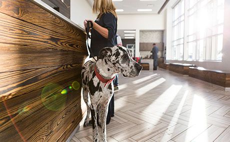
Architect Michael Matthys, VP of LindenGroup Architects in Orland Park, Illinois, was instrumental in creating a multiple-award-winning space for Coyne Veterinary Center in Crown Point, Indiana. In addition to other building awards, the hospital earned a coveted 2019 dvm360 Hospital Design Competition Hospital of the Year for 8,000 square feet or more. We spoke with Matthys about some of the design choices made for this 15,633-square-foot, state-of-the-art general practice.
Coyne makes good sense
This Hospital of the Year was featured in the March 2019 issue of dvm360. See a more in-depth version of the story here at dvm360.com/coynehd.
In the zone
Site selection for the practice was a struggle, to say the least, but the firm's design build team worked through the zoning process with practice management and city officials. Proximity to State Highway 65 and a location in the fast-growing, established community of Crown Point were priorities, but the first site selected for the new building was denied zoning due to proximity to residential areas. “The development team engaged with the city's planning department, mayor, and district councilman to find a site that would work,” Matthys says.
Zoning challenges continued beyond site selection, as the design team had to respond to design standards for the selected area that called for a colonial-style architecture. “To meet those challenges, Dr. Coyne and the design team pushed the limits of the stylistic standard focusing on quality building materials,” Matthys says.
Down to details
- Coyne Veterinary Center: Crown Point in Crown Point, Indiana
- Practice owners: John Coyne, DVM, and Jeremey Buishas, DVM
- Doctors: 3 full-time, 1 part-time
- Staff: 30 full-time, 5 part-time
- Building square footage: 15,633
- Exam rooms: 11
Tip: Don't get discouraged. Even award winners run up against City Hall sometimes.
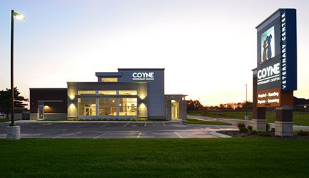
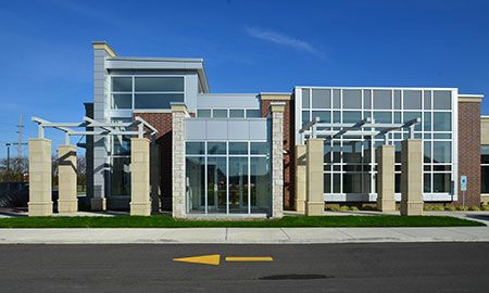
An eye-catching roofline
A multilayer roof coupled with a façade of glass, brick and stone add architectural interest to both the exterior design and the interior spaces. Elements that add layers of structure and cost to a project must be weighed against the overall project budget, but this design feature was well worth the expense. “From the onset of this project a major goal was to create an eye-catching design along the highway that would be noticed.” Matthys says. “Steps in the roof and ceilings provide opportunity for clear story glazing that floods the lobby with natural light.”
Tip: When you're thinking about architectural features that will potentially wow clients for years to come, you need to be thoughtful about the cost-benefit ratio: expensive aesthetic vs. new clients over time who will see and admire your vision.
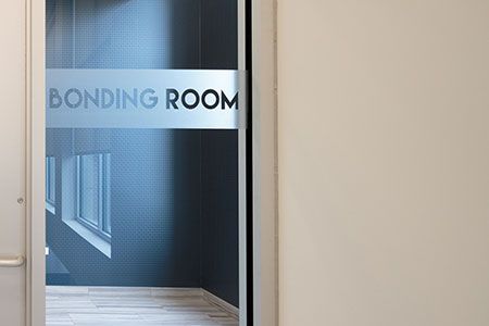
Bonding room pays off big
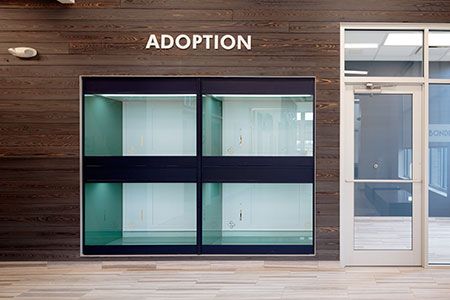
The reception area in Coyne Veterinary Center houses a unique space intended to help homeless pets get adopted. Developed from Coyne's partnership with nearby animal shelters, the bonding and viewing room puts adoptable pets front and center. “Allowing families to meet homeless pets from the community shelters has been a great success,” Matthys says. “The bonding room provides a quiet space that is sound proofed with our typical exam room sound wall, which includes in-wall Roxul Mineral Wool Sound Insulation installed up to roof deck.”
Tip: Think of ways your building can highlight for clients your love animals that reaches beyond your clientele into the world. (It helps to make things fun, too.)
Transparency + privacy = great exam spaces
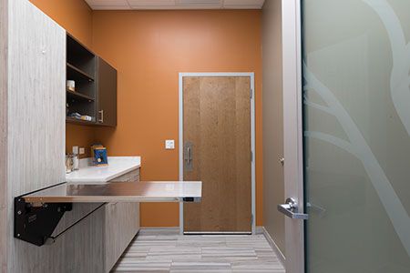
For the 11 exam rooms surrounding the L-shaped reception area, the firm chose aluminum doors with large frosted windows and a transom: “Frosted doors provide added light and offer a feeling of transparency while also affording privacy,” reads the contest entry.
Why this design choice? “Our veterinary projects often end up with exam rooms internal to the building,” Matthys says. “We look for creative ways to bring natural light into these spaces.” As an added feature, a custom etched tree design was created for the lobby side of the glass exam room doors. “These effects can be accomplished at a lower cost by applying vinyl material to glass, but this offers less durability,” Matthys notes.
Tip: Think about ways to get light into spaces, and consider whether you're ready for more transparency in your new hospital: Do you just want to take all the animals to “The Back,” or would you like to do more to show new and regular clients the amazing medicine you practice?
Sign, sign, everywhere a sign
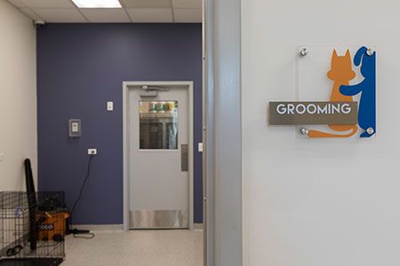
Branding signage throughout the practice was created with dimensional letters cut from half-inch-thick acrylic sheets. Room signage integrates Coyne's logo, while boarding and play rooms are identified with cut vinyl applied to glass. Last but not least, cut vinyl numbers applied to glass transoms identify each exam room.
Selecting the practice's signage was a collaborative effort between the practice's internal development team and the design build team. “Font sizes and placement of signage is considered early in the design process and coordinated with the architectural drawings and preliminary renderings,” Matthys says.
Tip: Signage and interior decoration is often an afterthought after long, costly builds. But the right fonts, the right colors and the right plan for directing traffic through your hospital are things every pet owner and team member will appreciate.