The organized hospital (yes, it is possible)
Your veterinary practice may not be cluttered (or maybe it is), but that doesn’t mean it’s organized. Take these tips and make your space more efficient, attractive and tranquil.
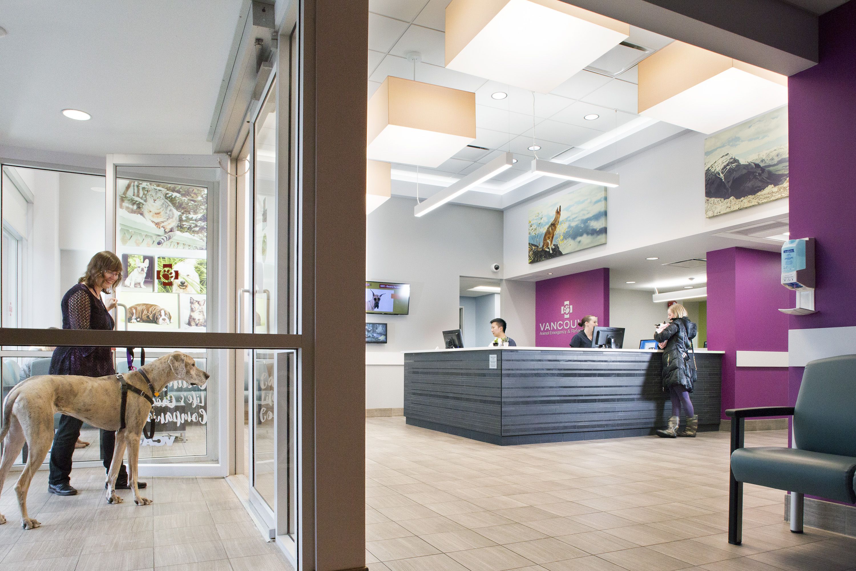
The decluttered front desk at VCA Vancouver Animal Emergency & Referral Centre offers a calm feeling when pet owners arrive.
Like a lot of people, I have embraced the decluttering movement in my own life, and I shared numerous ideas for decluttering veterinary hospitals in a dvm360 article on the topic.
Decluttering can be very helpful and a great place to start, but decluttering in itself does not create a great place for work. Let’s tackle the fundamentals of reorganizing your veterinary workspace so that it is inherently beautiful and functional.
Think hospitality in client waiting areas
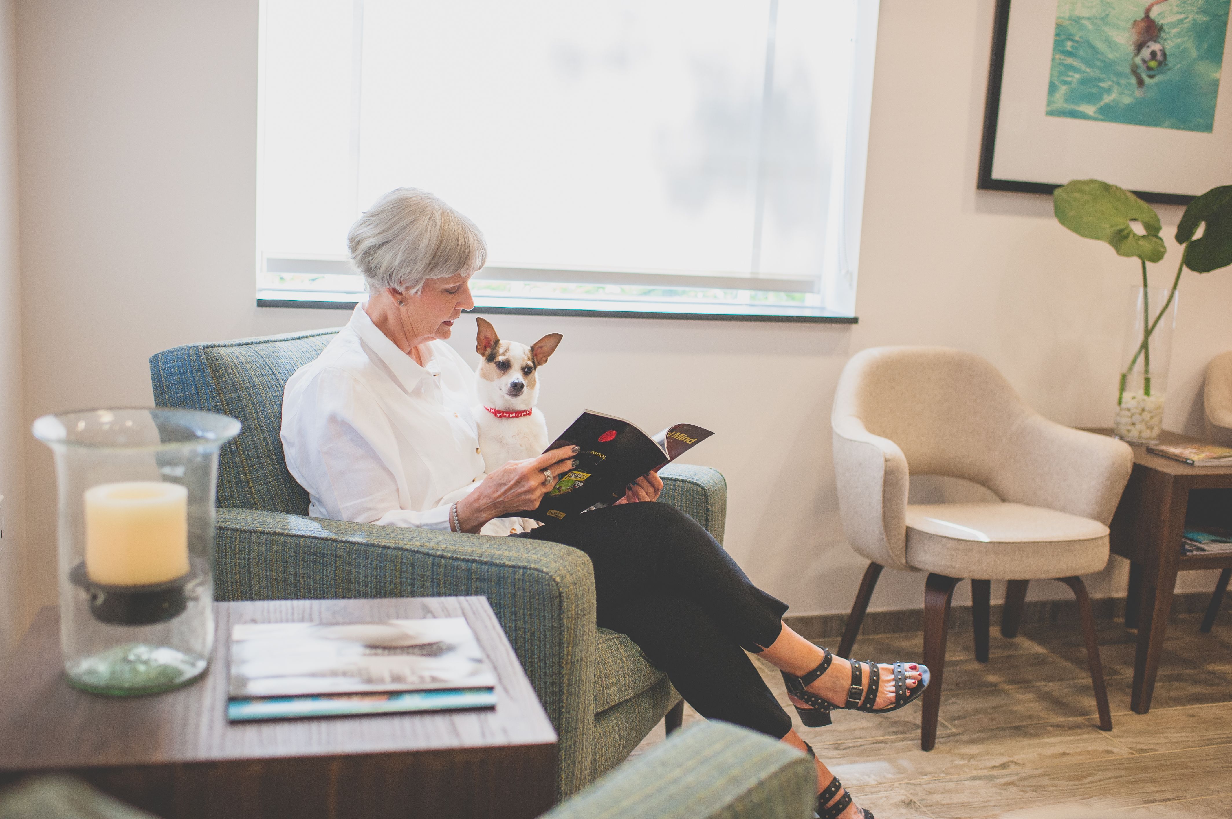
If we replace the word “hospital” with the word “hospitality,” we can envision better client waiting experiences. The current trend is to make waiting rooms smaller yet more comfortably furnished, and to use most client-allocated square footage in the exam rooms. Thus, the waiting area is for purposeful and intentional waiting, and wants to have a hotel-lobby feel, rather than the more typical airport-terminal feel.
The waiting area at Fetch Specialty & Cancer Veterinary Center in Bonita Springs, Florida has a distinct hotel lobby feel. (Image courtesy of Anne Willette Photography)
To continue with the hospitality atmosphere, the front desk should be beautiful to behold, decluttered and spare, and should feature artwork, signage, color and lighting, and nothing else. The client should not be looking at files, piles of paper, knickknacks from vendors, unnecessary signs and pamphlets, etc. A clean desk is a much better advertisement for excellent medicine and customer service, as it places nothing between the reception staff and the clients.
Rein in retail
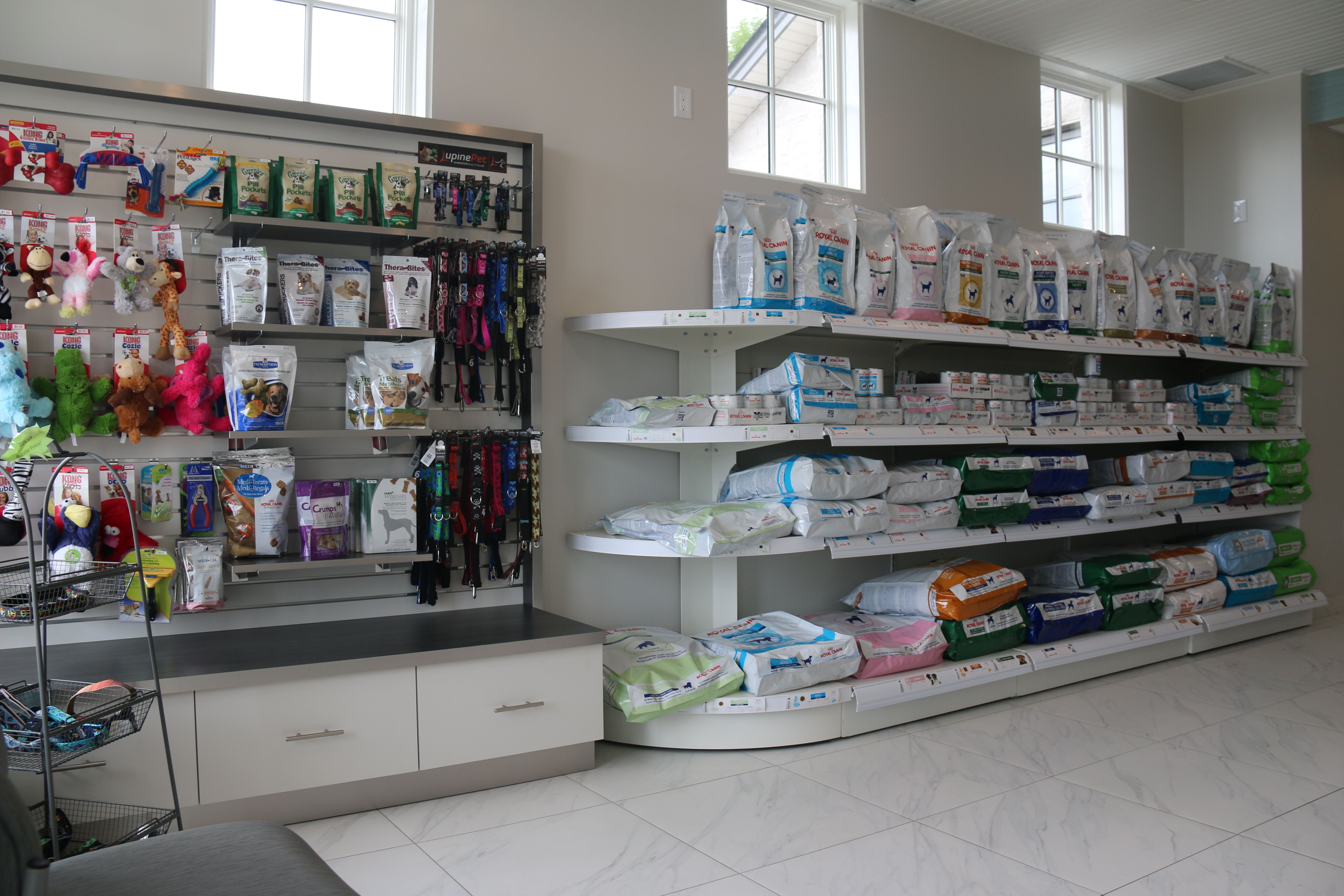
Retail is notoriously junky. If you do choose to offer retail, be fastidious about the design of the shelving to display the goods properly. Restock from a nearby closet or from the stockroom frequently to prevent piling and using retail as de facto storage. You should not have more than one or two of any given item in the retail area at a time.
All of the products for sale at Callbeck Animal Hospital in Whitby, Ontario are neatly arranged, with only one or two of each item on display. (Image courtesy of Callbeck Animal Hospital)
Contain your pharmacy
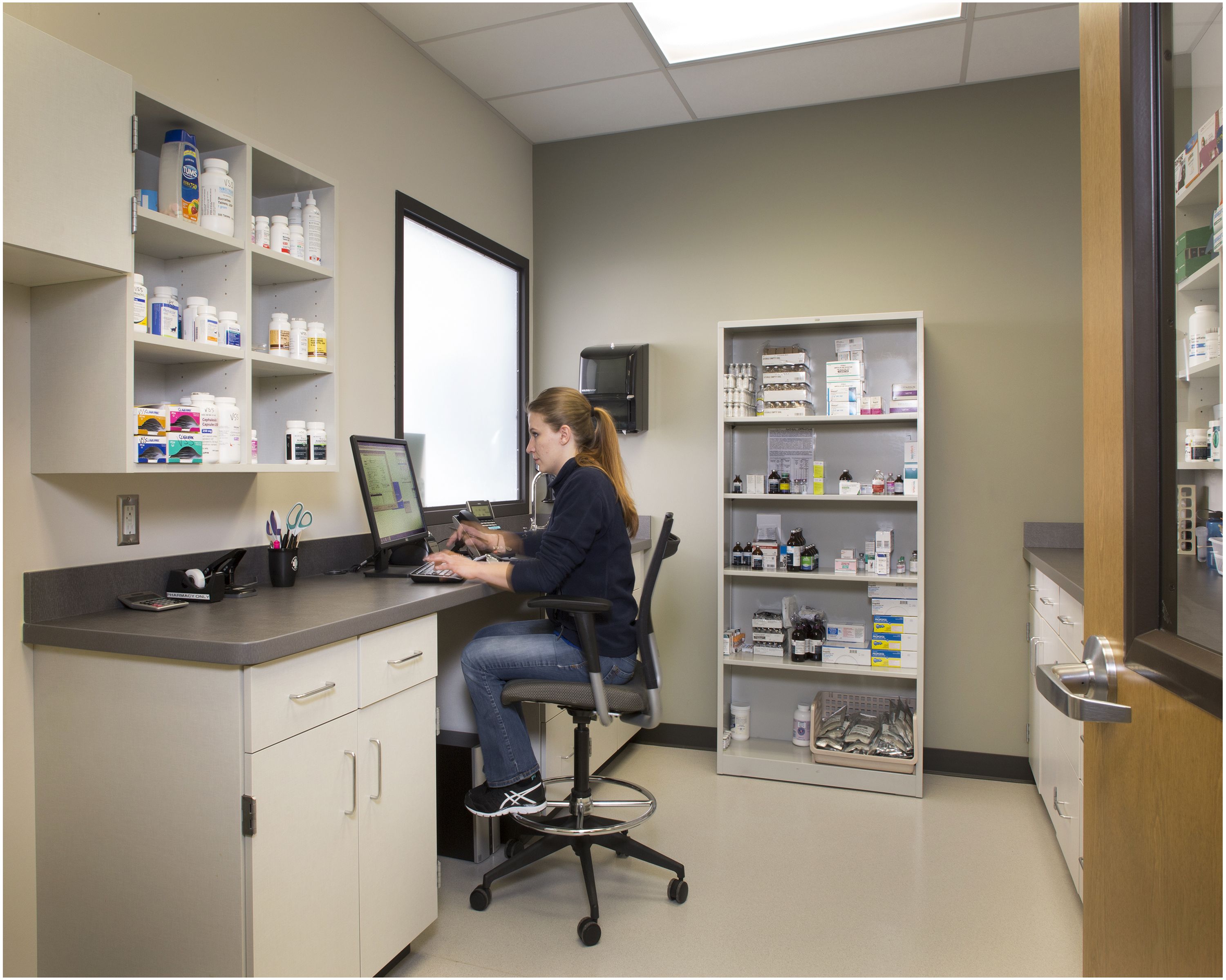
By their nature, pharmacy areas are cluttered. To counter this inevitability, the best pharmacy designs have open or glass-fronted shelving so every item can be seen. It is best to confine all pharmacy items to one space for best inventory control practices. A self-contained pharmacy is also easier to keep organized than one that flows amoeba-like into other parts of the hospital.
The enclosed pharmacy at Pet Emergency Clinic and Referral Center in Spokane, Washington. (Image courtesy of Foto Imagery / Tim Murphy)
Prioritize point-of-use storage
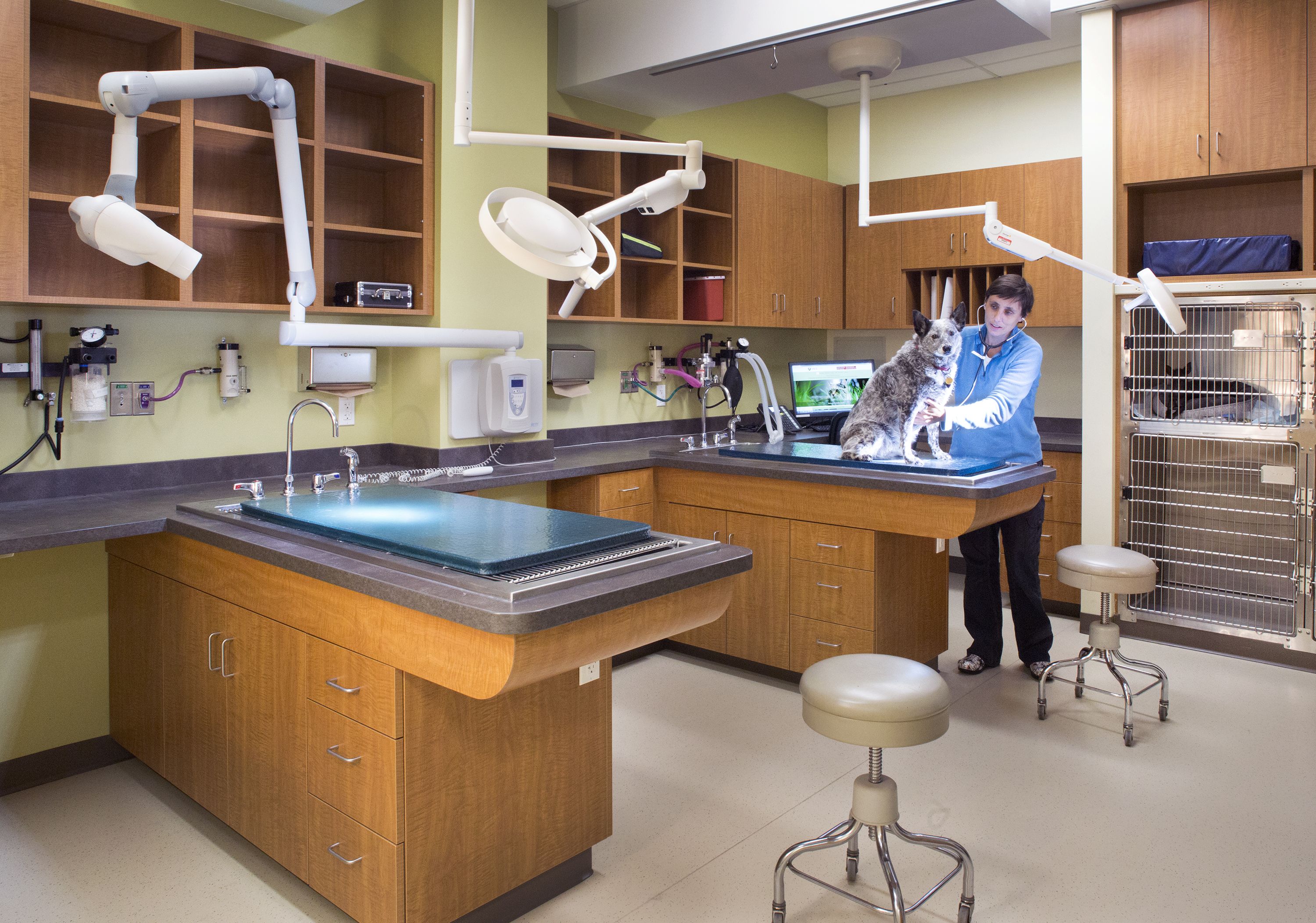
In the working portions of the hospital, one of the effective techniques of keeping a space tidier and more functional is to purposefully store items right where they are used. This seems simple until you realize that most hospitals are not really designed for this type of convenient storage. In our office, we pay careful attention to three types of point-of-use storage:
- Over-cage cubbies. These are so useful for towels, fluid pumps and other items that are needed for patient care.
- At the treatment table. Another great place for open cubbies above, and drawers below, is right at the treatment table. Having gauze, gloves and other supplies within easy reach of where you’re working is efficient and effective. We keep other surrounding cabinets in the treatment area closed to reduce visual clutter.
- Equipment parking spaces. If you’re using a piece of equipment in a space, it should be parked in a designated spot in the same space. For example, dental carts should be kept in an assigned place adjacent to the dental table.
Overhead cubbies and treatment table storage allow for organization and easy access to supplies. (Image courtesy of Foto Imagery / Tim Murphy)
Design your staff areas to look clean
Places where your staff are relaxing or eating should be sanitary and clean. Use closed cabinetry and provide adequate storage so counters remain clear. Use cool colors such as greys and blues, which look cleaner than creams, yellows and browns. Provide windows to the outside, which are calming and allow for natural daylight. Provide cleanable materials on seating, tables, floors and counters so that everything can remain spotless.
When in doubt, line it up
This idea is more about creating visual order than any physical organization, but it is pure magic. We use this technique as often as possible. Align windows internally and externally. Align wall protection with countertops. Align room finishes in the same space. Align photos on a wall. In addition to calming your mind, aligning items can have functional benefits as well.
Summary
The benefits of tidy and visually ordered medical environments are just now being studied. I believe this direction of study will change our world in ways we can’t yet even imagine. For example, at Mercy Medical Center in Oklahoma, after decluttering and reorganizing the spaces at the nurses’ stations, nurses save a measured 21 hours per year that would previously have been spent looking for a stapler!
It’s time to liberate yourself from the tyranny of disordered workspaces. Your clients will love a purposeful and tasteful clutter-free space. You will love having items where you need them. Your staff will love saving time, and they will be more relaxed in spaces that are easy to maintain and clean.
Heather Lewis, AIA, NCARB, is a partner at Animal Arts, an architecture firm in Boulder, Colorado and frequent Hospital Design 360 conference speaker. She's a lighting geek and a (seriously) devoted advocate of minimizing pets' stress and anxiety during their veterinary visits. She has designed practices and shelters that range in size from 1,200 to 110,000 square feet. During grad school (as a break from architorture) she trained miniature horses to pull carts!
