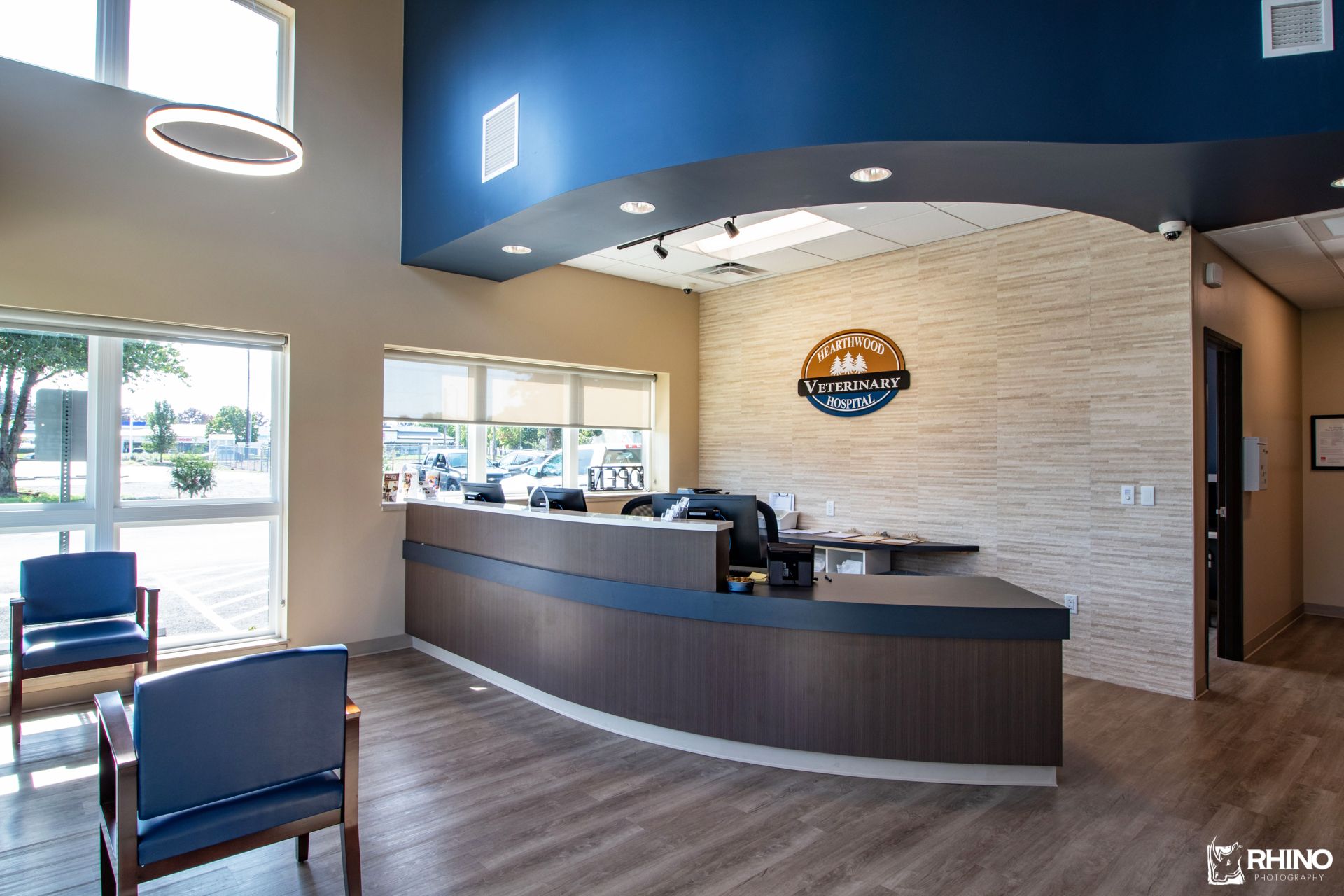
Creating a warm, cozy atmosphere in a veterinary hospital is a feat in and of itself. At Hearthwood Veterinary Hospital in Vancouver, Washington, they had the ambience down pat after nearly 50 years in business.
“People liked the hominess of our practice. We had a special, comfortable ambience that people loved,” says co-owner Samuel Kopman, DVM. “Our team is fastidious, and the place was always very clean and smelled good, even as an old building.”
The size and flow of the practice, however, needed some help. Dr Kopman and his practice manager wife, Renee, bought the business in 2007 and set out to improve on the practice’s charm in a larger, more organized facility less than 10 years later.
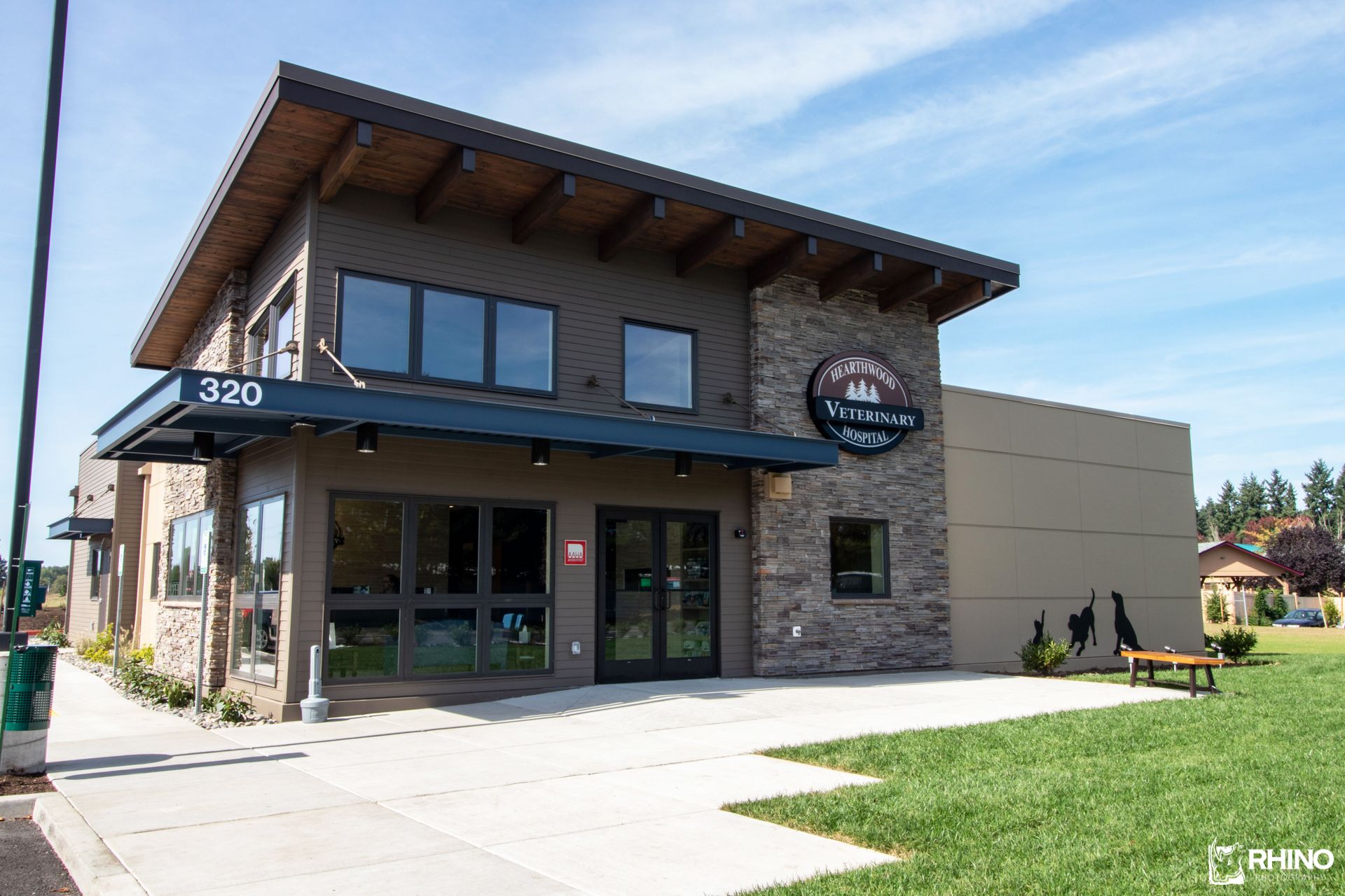
Not only did the Kopmans get the design they longed for, they also maintained and even enhanced the ambience they were known for. And that excellence in design earned Hearthwood Veterinary Hospital a Merit Award in the 2020 dvm360 Hospital Design Competition.
Designing for efficiency and comfort
In 1970, the first iteration of Hearthwood Veterinary Hospital came to life as a contemporary, state-of-the-art practice. That facility served the community well for many years. Fast forward to 2018 or so, and that contemporary practice was a bit dated and in need of an update. The Kopmans decided it was time to build new and were able to find a piece of land immediately adjacent to the original site.
The new 4050-square-foot practice sits at the opening of a subdivision and was designed to fit into the esthetic of the neighborhood. “We are near a retired airfield that is being developed into a mix of high-density residential and assisted-living apartments, as well as a retail area,” says Dr Kopman. “We were lucky to build into this growing area, having blind faith that it would work out.”
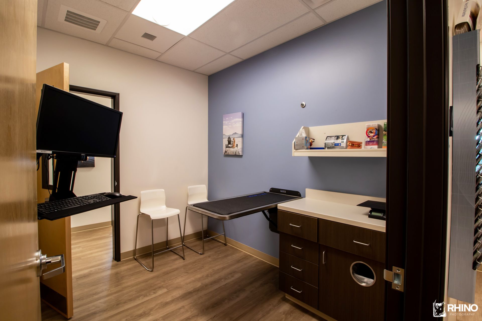
Previously, with just 3 small exam rooms, clients often had to wait their turn, even for quick technician appointments, and they had to pass through an exam room to get to the back of the hospital. So, building with a clean traffic flow and plenty of space was at the top of the list for the new practice.
And during the pandemic, Kopman is especially glad to have more space that allows him to get clients into exam rooms more quickly and sometimes to check them out from the exam room. “We have workstations in the exam rooms, allowing us to take notes and wrap up paperwork quickly, allowing clients to check out more quickly,” he says. “Our goal is to get proficient checking clients out in the exam rooms, especially during COVID-19, to minimize time in the waiting area. And, it's just less stressful for owners and animals altogether, not sitting clumped together in the waiting area.”
Even during the pandemic, Hearthwood Veterinary Hospital has seen a 30% increase in revenue, proving that the new building was worth the expense. “We are doing really well here. It's been a pleasant surprise,” Kopman says.
A nod to the past
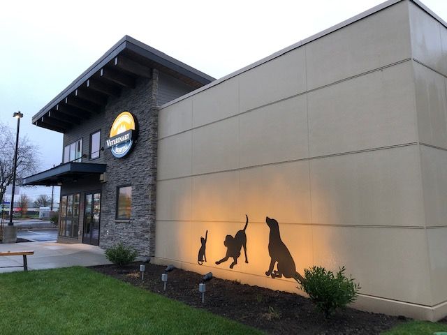
When the Kopmans first bought the practice in 2007, Dr. Kopman took down some large cat and dog silhouettes that decorated the outside of the clinic, not realizing what those decorations meant to the community. Clients immediately let the owners know they missed the iconic designs they associated with the practice.
So, upon moving into the new facility, Kopman had some new signs made. “We carried over a touch of the old to our new facility, giving the silhouettes a more modern touch,” he says. He also added a bench and lawn chairs outside the facility, which have come in handy during COVID-19. He says the chairs give the neighborhood clinic a more welcoming feel.
While their previous facility already evoked the ambience their clients loved, the Kopmans knew they could do even more. Adding a cool-touch electric fireplace to the lobby was just the touch they needed, says Renee Kopman. “The fireplace separates the cat waiting area in the lobby, giving a natural division to the space,” she says. “And being here in the Pacific Northwest, where it’s gray and cool a lot, the visual warmth it provides adds to the environment.”
Combined with all the natural light, stone, tile, and natural wood, as well as the coffee refreshment station, Kopman says it makes for a place where clients say they just want to sit and enjoy a cup of coffee and relax. What better compliment to a hospital’s design than a client wanting to stay there longer!
Invest in what you want
Budgets are top of mind for most when building a new practice. But Dr Kopman cautions that you should never short yourself on what you really want in your practice.
By the numbers: Hearthwood Veterinary Hospital
Owner: Samuel Kopman, DVM, and Renee Kopman
- Exam rooms: 5
- Total cost:$1,440,063
- Cost per square foot: $355
- Square footage: 4050
- Structure type: Freestanding
- Architect:Architectural Werks, Inc.
- Photographer:Spencer Redlinger
“It’s easy to get sticker shock; everything is expensive when building a practice,” he says. “But don’t compromise on your core principles.”
He says it's worth it to get what you really want in the long run, within reason. Dr Kopman allowed himself to splurge a bit on exterior features, such as the stonework and some of the larger design elements, as well as the lobby fireplace, knowing that curb appeal and setting a tone are very important.
“I’m really glad we didn’t skimp on this area,” he says. Of course, that’s not to say you should build beyond your budget, he says. But if you can swing it, do it; get the design you really want, as you’ll have to live with it for a long time to come.
Sarah A. Moser is a freelance writer in Lenexa, KS.
